Lo-Type
Lo-Type (sometimes Lo-type, or Lo Type; originally Lo-Schrift) is a display typeface originally designed by Louis Oppenheim. Oppenheim named the font using his own initials which he also used to sign his work. Oppenheim designed the avant-garde Lo-Type for Berthold during 1911–1914 under the influence of the emerging modernist era, thus participating in its outburst. In 1980, Oppenheim's Lo-Type was reintroduced with additional weights for phototypesetting by Erik Spiekermann and is still in use today.[1]
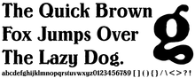
In its extreme thick–thin contrast balanced with hearty roundness and humorous detail, Lo-Type was originally designed as a display type for advertising, posters and headlines. Typical of its time, it has an irregular outline which gives it a hand cut or ink painted feel. The large x-height and intentionally idiosyncratic shapes make it particularly eye-catching and unique.