x-height

In typography, the x-height or corpus size refers to the distance between the baseline and the mean line of lower-case letters in a typeface. Typically, this is the height of the letter x in the font (the source of the term), as well as the v, w, and z. (Curved letters such as a, c, e, m, n, o, r, s, and u tend to exceed the x-height slightly, due to overshoot.) One of the most important dimensions of a font, x-height is used to define how high lower-case letters are compared to upper-case letters.
Design considerations
High x-heights are often found in fonts intended for display, such as on signs and advertising hoardings, which need to be read clearly from a distance. This, though, is not universally the case: some display typefaces such as Cochin have low x-heights, to give them a more elegant, delicate appearance when printed large.[1] Many sans-serif designs that are intended for display text have high x-heights, such as Helvetica or, more extremely, Impact.
Medium x-heights are found on fonts intended for body text, allowing more balance and contrast between upper- and lower-case letters and a brighter page. They then increase again for optical sizes of font designed for small print, such as captions, so that they can be clearly read printed small.[2][3]
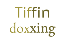
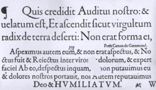
High x-heights were particularly common in designs in the 1960s and 70s, when International Typeface Corporation released variations of older designs with boosted x-heights; notable examples of this trend include Avant Garde Gothic and ITC Garamond.[4][5] More recently, some typefaces such as Mrs Eaves and Brandon Grotesque have been issued with distinctively low x-heights to try to create a more elegant appearance. While computers allow fonts to be printed at any size, professional font designers such as Adobe issue fonts in a range of optical sizes optimized to be printed at different sizes.[6] As an example of this, Mrs Eaves exists in two versions: an original style intended to give an elegant, bright appearance, and a less distinctive 'XL' design intended for body text. [7]
Some research has suggested that while higher x-heights may help with reading smaller text, a very high x-height may be counterproductive, possibly because it becomes harder to identify the shape of a word if every letter is nearly the same height. For the same reason, some sign manuals discourage all-capitals text.[8][9][10]
Use in web design
In computing, one use of x-height is as a unit of measurement in web pages. In CSS and LaTeX the x-height is called an ex. The use of ex in dimensioning objects, however, is less stable than use of the em across browsers. Internet Explorer, for example, dimensions ex at exactly one half of em, whereas Mozilla Firefox dimensions ex closer to the actual x-height of the font, rounded relative to the font's current pixel height. Thus, the exact ratio of ex to em can also vary by font size within a browser if the determined values are rounded to the nearest whole unit. For example, a browser calculating an x-height of 45% on a font 10 pixels tall may round ex to either 4 pixels or 5 pixels or leave it at 4.5 pixels.
Other important dimensions
Lowercase letters whose height is greater than the x-height either have descenders which extend below the baseline, such as y, g, q, and p, or have ascenders which extend above the x-height, such as l, k, b, and d. The ratio of the x-height to the body height is one of the major characteristics that defines the appearance of a typeface. The height of the capital letters is referred to as Cap height. X-height is most important in regular designs, such as most serif and sans-serif designs; script typefaces that mimic irregular handwriting and calligraphy may not have a consistent x-height across all letters.
See also
References
- ↑ "Chaparral® Pro release notes" (PDF). Adobe. Adobe. Retrieved 5 November 2014.
- ↑ "Optical Size". Adobe. Retrieved 7 November 2014.
- ↑ Frere-Jones, Tobias. "MicroPlus". Frere-Jones Type. Retrieved 1 December 2015.
- ↑ Simonson, Mark. "Indiana Jones and the Fonts on the Maps". Retrieved 6 November 2014.
- ↑ Bierut, Michael. "I Hate ITC Garamond". Design Observer. Retrieved 6 November 2014.
- ↑ Slimbach & Brady. "Adobe Garamond" (PDF). Adobe. Archived from the original (PDF) on February 23, 2015. Retrieved 6 November 2014.
- ↑ `. "Introducing Mrs Eaves XL" (PDF). Emigre. Retrieved 6 November 2014.
- ↑ Bertucci, Andrew. "Sign Legibility Rules of Thumb" (PDF). United States Sign Council. Retrieved 22 June 2015.
- ↑ Herrman, Ralph. "Does a large x-height make fonts more legible?". Retrieved 22 June 2015.
- ↑ Hermann, Ralph. "Designing the ultimate wayfinding typeface". Retrieved 22 June 2015.
External links
Typography terminology | |||||||||||||||
|---|---|---|---|---|---|---|---|---|---|---|---|---|---|---|---|
| Page | |||||||||||||||
| Paragraph | |||||||||||||||
| Character |
| ||||||||||||||
| Classifications |
| ||||||||||||||
| Punctuation | |||||||||||||||
| Typesetting | |||||||||||||||
| Typographic units | |||||||||||||||
| Digital typography |
| ||||||||||||||
| Related | |||||||||||||||
| |||||||||||||||