Georges Peignot
| Georges Peignot | |
|---|---|
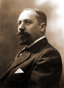 Georges Peignot, age 38 | |
| Born |
24 June 1872 14th arrondissement of Paris |
| Died |
28 September 1915 Givenchy-en-Gohelle |
| Alma mater | École nationale supérieure des arts décoratifs, learning |
| Occupation | type designer, type founder, manager of the G. Peignot & Fils foundry |
| Years active | 1896–1915 |
| Known for | typefaces: Grasset, Cochin, Auriol, Garamont |
| Spouse(s) | Suzanne Peignot[*] |
| Awards | Croix de guerre 1914–1918, Médaille militaire, French Order of Academic Palms |
Georges Peignot (Paris, June 24, 1872 – Givenchy, September 28, 1915) was a French type designer, type founder and manager of the G. Peignot & Fils foundry until his death in the World War I. Father of four children (including poet Colette Peignot called Laure), he hoisted the G. Peignot & Fils foundry among most striking French typography companies of the twentieth century (an « elite house »,[1] according to a former French Prime Minister): in 17 years of practice, he created or launched prestigious fonts, including Grasset, Cochin and Garamont.
Early years
Born in 1872, Georges Peignot was the fourth child of eight. His father, Gustave Peignot (1839–1899), engineer graduated of Arts et Métiers school,[2] was the head of a fixed spaces foundry (specialized in the fabrication of hand-set metal type to achieve letter-spacing) in Paris, created in 1842 by Pierre Leclerc[2] and bought and directed by his mother, Clémentine Dupont de Vieux Pont (1815–1897), widow of Laurent Peignot.

Georges Peignot frequented unsuccessfully the Chaptal College in Paris, before attending an apprenticeship[2] with his godfather, Émile Faconnet, master intaglio printer.[3] In 1890 he was admitted to "Arts Déco" school. In 1891, he moved to Germany, first in Leipzig in the Schwinger foundry where he discovered the world of printing and learned punchcutting. In 1892, he was in Hamburg in the Gentzsch foundry[4] where, with the son of the family, same age, he toured the services and workshops, continued to be passionate about types, and passed all his spare time admiring international typographic catalogs.
Back in France in 1893, Georges Peignot spent two and a half years in military service, where he graduated sergeant, the highest rank for those who do not have the baccalaureate. In 1896, he married Suzanne Chardon, daughter of a master intaglio printer in charge of chalcography for the Louvre.[5] They had four children (Charles, 1897; Madeleine, 1899; Geneviève, 1900; Colette, 1903).
In 1896, hired in his father's owned "G. Peignot" foundry, Georges Peignot was responsible for the management of recently acquired types (G. Peignot et Fils has had absorbed Cochard & David foundry and Longien foundry) and possibly for creating new fonts.[6] In 1898, his father, suffering, transformed the company into a Kommanditgesellschaft on behalf of "G. Peignot et Fils" and distributed the shares to his 8 children. He had time to appoint Georges co-manager before dying the following year. In 1899, Georges Peignot became officially sole manager of the company. Board members were Robert Peignot, eldest son, engineer in charge of manufacturing, Georges Peignot, and Charles Tuleu, husband of Jane Peignot, the eldest daughter, and owner of the rival foundry Deberny. In 1906, Paul Payet, husband of Julia Peignot, the second daughter and close ally from Gustave Peignot's widow, top executive in a railways company, joined the board on the instruction of the widow.[7]
Grasset (1898)
In 1897, Georges Peignot, young industrialist aged 25, met Eugène Grasset already famous in the Art Nouveau world (for his furniture, posters, stamps, titles and patterns of books, textiles and printed wallpapers, etc.). Grasset has had freely adapted to the alphabet of Nicolas Jenson (1471) with the intention of using it to print a book on his own method for ornamental composition, inspired by the courses he gave to the Guérin school. With his father's agreement, Georges Peignot acquired Grasset's alphabet, get an official patent October 7, 1897 for the typeface under the name "Grasset" and gave Henri Parmentier, the workshop's punchcutter, the mission to engrave it. For harmonious compositions, he decided to offer 13 sizes of the same type, and « for the first time in a French workshop, the scale of sizes of a character is created by photographic reductions of a genuine drawing » (Thibaudeau). In the fall of 1898 comes out, printed in Grasset, Les aventures merveilleuses de Huon de Bordeaux, chanson de geste (a medieval novel, since the Middle Age is the favorite epoch of Art Nouveau). The world of typography was alerted and revealed very supportive. In 1900, only 7 sizes were punched, but orders showed up. Georges Peignot and Francis Thibaudeau, high-quality master typographer he has hired, created a small catalog, discreet but very tasteful. After the sending to all important printers, the orders flocked to the company, and in the same time compliments praised from specialized press and art connoisseurs. In the courtyard of the Boulevard de Montrouge (later renamed "boulevard Edgar-Quinet") where they settled for 34 years, the Peignot workshops were suddenly engorged.[8] The company has had to move at the corner of Cabanis and Ferrus streets (XIVth arrondissement) in Paris, and the new plant opens in 1904.
The success meant for Georges Peignot, 29, the recognition of his peers: he became treasurer of the Chambre syndicale (typographic trade association). His work was also copied: in June 1902 the justice seized forged types of Renault foundry and the two foundries went on court. Surprisingly, the infringement case has been lost in 1905 and the company G. Peignot & Fils has had to pay the costs for… having accused Renault foundry of being inspired by Gryphe work, a Lyon publisher of the sixteenth century, amateur of Jenson, whose work belongs to all and can be copied. The judges have had no regard for the particular draw of reed and other specific qualities of Grasset.
Two of Georges Peignot's brothers, Robert (engineer of Arts et Métiers) and Lucien (engineer of the École centrale), sailed to the United States where they know they could find the most modern automatic typographic machines.[9]
Auriol and other fonts (1902)
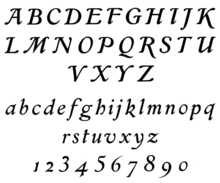
In 1898, Georges Peignot ordered an Art Nouveau typeface to George Auriol (aka Georges Huyot), a gifted singer-poet-painter. A year later, Auriol proposed already "la Française-légère". Georges Peignot filed it October 11, 1899, and launched the punchcutting despite family's opposition.[10] In 1902 the complete alphabet was available in five sizes. Success was around the corner again, but the career of the new typeface was not as productive as the Grasset: Française-légère is a fantasy typeface, unlike Didot or Garamond devoted to serious works, and it's intended for short texts, advertising, subtitles, etc. Therefore, the use is not so frequent, nor the replacement of lead fonts: for a foundry, it's not a good deal.
During the following years the fantasy production was still privileged: Georges Peignot's foundry launched "l’Auriol Labeur " (Auriol book, 1904), the "Française-allongée" (1905), "Auriol Champlevé" (1906), the series of eight "Robur" typefaces (black, pale, striped, clair-de-lune, etc., 1907). Promoting these "fancy" characters, Georges Peignot played with the classic structure of the letter (unchanged since the fifteenth century), and took easily the risk that its customers would sacrifice readability to the beauty of characters, very "Art Nouveau". He advocated a "Typography", which meant – for him – that a typeface comes with many sizes, italics, vignettes and ornaments. Sort of typographic philosophy!
In the continuity, the foundry launched a series of ornaments and vignettes for the Grasset typeface. The creations of George Auriol were also enshrined in two series of « creepers, flowers, flames » that Francis Thibaudeau laid out in two booklets (Vignettes Art Français et Ornements français, 31 pages to be published again in the Spécimen général few months after). G. Peignot et Fils released also a booklet entitled Album d’application des nouvelles créations françaises (Catalog for applications of new French creations, 1901), real pamphlet written by Francis Thibaudeau in favor of Art Nouveau.
Publication of the Spécimen (1903)
Only after having launched "Grasset" (thirteen sizes) and "Française-légère" (five sizes), Georges Peignot decided to publish a Spécimen and thus to benefit from the enormous success of its new characters. All the fonts created or acquired by the G. Peignot & Fils foundry were there available.
The Spécimen consists of two volumes of 450 and 200 pages (the first appears at the end of July 1903, the second in 1906). The layout is generous: 7 chapter headings in 4 colors, airy presentation of each typeface or ornament, often in two colors, with variation of different sizes, funny or informative sentences. Beneath their aesthetic success, the two volumes were also useful: all the technical details that can be used in a printshop were clearly set out in tables, lists, diagrams: return rates and prizes of old fonts, sizes of various folded formats, instructions on cutting lines, etc. The text is serious and didactic: the last chapter is written by Francis Thibaudeau, who paints a retrospective of typography and its scenery, from the Renaissance to present day.
Cochin (1912)

Because the Grasset was slowing, Georges Peignot sought a new text dedicated typeface. In 1910, he launched the "Bellery-Desfontaines", an upscale fantasy character in rupture with Art nouveau style: any vegetal form was excluded.
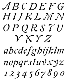
Georges Peignot found inspiration in the engravings of the eighteenth century: supported by Lucien Peignot, his younger brother became co-manager and close friend, and by Francis Thibaudeau, his typography master, he noticed that the writers of this time rejected the solemn style of founders like Louis-René Luce, Fournier, Didot... and preferred to engrave themselves the text accompanying their illustrations. Georges Peignot was impassioned by the work of the writer and illustrator of Menus-Plaisirs du roi : Cochin. He proposed then a new typeface, inspired by a design found in the archives (still anonymous today), gave it the name "Cochin" and submitted in October 1912.[11] That was not all. He proposed a complete typeface suite, 2000 punches (in January 1914), composed of a "Nicolas-Cochin" stretched to the poles, a "Moreau-le-jeune" champlevé, and a 200 years old fantasy typeface, "Fournier-le-jeune". Last but not least, adequate decorations and decorated letters were entrusted to Pierre Roy and André-Édouard Marty, illustrators to La Gazette du Bon Ton.
In 1912, the Cochin suite was launched on the market in two different ways: the first coup recalled the publication of the medieval book for Grasset and consisted, before marketing the lead fonts, to compose in Cochin a new fashion magazine: La Gazette du Bon Ton (launched by Lucien Vogel of Vogue, the Jardin des modes, etc.). The success was great, not only because of Cochin only but also because the magazine wss beyond anything seen in terms of taste, quality of illustrations (mostly watercolors), discovery of new trends, etc. The second and most important promotional vehicle of Cochin was a high typographic quality booklet, published January 18, 1914, and sent to all Paris, including typographers, printers, artists, journalists… The trio composed by Georges Peignot, Lucien Peignot, and Francis Thibaudeau has had time to polish up their weapons of seduction: it took two years for cutting 62 alphabets, plus ornaments and vignettes. The result, as it was possible to admire it, was in the booklet, and the booklet itself: pink and gold cover, white and mid-tone laid paper, black, gold and color printing, examples or bilboquets on full pages, precious illustrations by the use of Roy and Marty vignettes… The text too, written by Lucien Peignot, is of excellent literary outfit.
Garamont (1912)
Thanks to Cochin suite and to some very profitable and recent acquisitions (thus the "Didot" from the Beaudoire foundry), the profits of the company G. Peignot & Fils rose to unforeseen heights. Unfortunately, Georges Peignot did not benefit because he was put in minority within the company's board after a maneuver of his own mother (who thereby expressed his hostility to the unloved son and his preference for his two eldest, Jane and Robert, that her husband had had previously excluded from company's decisions).[12] Added to the personal attacks within his family, Georges Peignot has had also serious concern caused by constant improvements of automatic typographic machines he intended danger since 1905.[13] Rejected, depressed, Georges Peignot stepped back from the daily management of the company and confided it to his younger Lucien Peignot.
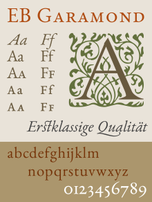
He was dedicated to the launch of a new character. He had noticed that the Garamond typeface of the sixteenth century has been created at a time when we printed on thick coton-based paper, in which the characters sank, leaving a greasy track. The same typeface used on a wood-based paper seemed thin. His idea was to re-draw the character with the original bold effect found on rag paper. He started manufacturing a new Garamont (sic) character with the help of engraver Henri Parmentier. The result will be presented and marketed in 1926 only,[14] 11 years after his death. It will be a great success, sustainable, prestigious.
Meanwhile, in 1910, Georges Peignot commissioned[15] the engraver Bernard Naudin for a new typeface in roman, italics and champlevé; the typeface is recorded in 1912 and 1913;[16] but it will be placed on the market in 1924, without much success.
War, sacrifice, death (1915)
When World War is declared, Georges was mobilized as adjutant of artillery of the Territorial army (composed of men aged 34–49 years, considered too old and not enough trained to integrate an active frontline regiment nor reserve). He was assigned to the 23rd Battery of the 1st Artillery Regiment and stationed at Fort Cormeilles. On September 25, 1914, his closest younger brother, André Peignot, was killed. The shock was immense for Georges Peignot. He immediately requested[17] to be placed on the front in the same regiment as his late brother, the 23rd Colonial Infantry Regiment. In March, he succeeded and was posted on the front line. Everything went fast: May 15, 1915, the youngest of his brothers, Rémy, was killed in the same Somme sector of the front. On July 25, Georges Peignot transmitted to his maternal cousin, Henri Menut, his power as manager of the company. September 28, 1915, north of Arras, between Souchez and Givenchy, Georges Peignot was struck by a bullet in the forehead « immediately after shouting to his troops: "En avant ! (Forward !)" », as Lucien Peignot reported (the fourth and last brother who will also lose his life June 29, 1916), and who had had time to conduct a long investigation to find his lost brother in the no man's land where he laid for a month.[12] Georges Peignot, buried next to Rémy, is quoted in the order of the Division and awarded the Military Cross and Military Medal.
Posterity
Louis Barthou, former French Prime Minister, wrote in 1916 about Georges Peignot that he was recognized « for his active and open mind, impatient of initiatives, for the righteousness of his strong and loyal character, for his simmering and thoughtful passion for the noble art to which he had devoted his life. »[1]
Georges Lecomte, Director of the École Estienne, said in 1918 about Georges and Lucien: « The Peignot brothers had conquered affectionate esteem of all book industry, of printers and publishers, of craftsmen and workers of the profession, of enthusiasts of fine editions, of writers who pay attention to how you print them. » They came in 1914 present him the Cochins and he still remembers « their tone of serious simplicity and modest satisfaction, (…) their refined but unpretentious friendliness. »

In 1922, the National "Committee for Education and Fine Arts" proposes to honor the history of Peignot: all the genuine punches of the Foundry and the bronze Gustave Peignot's statue are carried in the building of the Imprimerie nationale, across the Gutenberg street. The Committee proposes that the extension of this street would be called "rue des Quatre-Frères-Peignot" (Four-Brothers-Peignot street) in memory of the four dead brothers.
The typographer Maximilien Vox acknowledges his debt to Georges Peignot, for whom he was « the first French typographer who did not think of his job as confined to supplying the printer with little pieces of metal ».[18]
The foundry's posterity is tainted by family maneuvers: after the war, Georges Peignot and four of his other brothers are dead (whose eldest died of illness in 1913); the potential successors are the two girls or the mother. The latter manages in 1919 to impose his surviving children or their widows an 1 million capital increase, given to a competitor, the Deberny foundry, in financial difficulty… which is the property of Jane's husband.[12] In 1923, under the pen of Mr. Pascaut, notary, emerges a Deberny & Peignot company, result of the merger of Deberny (2.6 millions francs capital, 1 million Peignot's family included) and G. Peignot et Fils briefly renamed "Peignot & Cie" (4.1 millions francs). During half a century, Deberny & Peignot will struggle along, riding on its past glory, and goes out in 1974, bloodless, exposed to automatic typographic machines and phototypesetting machines, and a haphazard management.
Typographical creations
List of types created by Georges Peignot:
- Grasset book, Grasset italic, Grasset and Mr Lambert decorations
- Française-légère, Française-allongée, the Auriol-labeur, Auriol-champlevé, Robur and Vignettes and ornaments (drawing with brush : George Auriol, 1902-1907) ;
- Bellery-Desfontaines-large, Bellery-Desfontaines-étroit and Vignettes and patterns Bellery (drawing : Henri Bellery-Desfontaines, 1910-1912) ;
- Polyphème (bold) and Cyclopéen (light) (anonymous creation, 1910) ;
- Cochin book, Cochin italic, Nicolas-Cochin book, Nicolas-Cochin italic (drawing : Georges Peignot, from genuine 18th century engravings, engraved by Charles Malin), Moreau-le-Jeune, Fournier-le-Jeune, Fournier vignettes et ornaments (drawing : P. Roy et A. Marty) ;
- Garamont book, Garamont italic and Vignettes Garamont (ancient, Ben Sussan moderns, postwar) (engraved by Henri Parmentier, from prints on rag paper of the genuine Garamond typeface, under careful control of Georges Peignot (1912-1914) ; launched in 1926) ;
- Naudin book, Naudin italic, Naudin champlevé and Fleurons Naudin (drawing : Bernard Naudin, 1909-1914 ; launched in 1924) ;
- Guy-Arnoux capitales (drawing : Guy Arnoux, 1914, inspired by the revolutionary era. Not completed).
Decorations
References
- 1 2 Barthou, Louis (July 1916). "Lettres à un jeune français. XXV. La contagion sublime". Les Annales (in French) (1727).
- 1 2 3 Peignot-Tuleu, Jane (1915). Souvenirs de famille (in French). Paris: Deberny. p. 23.
- ↑ Faconnet, engraver, is a close friend of Marie Laporte-Peignot's parents (future wife of Gustave Peignot, father of Georges) and future Georges' godfather. A portrait of Marie Laporte-Peignot, girl, has been painted by Auguste Renoir; it can be seen at Limoges museum, region of Renoir's family.
- ↑ « Avant le front » ("Before the font"). Postcard from Hermann Genzsch to Georges Peignot, 1915 (?) & letter from Charles Peignot to M. Genzsch, 1926 (see Bibliothèque Forney, Fonds Peignot, B2/D8)
- ↑ Charles Chardon's workshops may be still seen at 10, rue de l'Abbaye, in Paris (courtyard).
- ↑ Froissart, Jean-Luc (2004), L’or, l’âme et les cendres du plomb. L'épopée des Peignot, 1815-1983 (in French), Paris: librairie Tekhnê, ISBN 2-9522836-0-5 (Gold, Soul and Ashes of Lead: the Epic of Peignot)
- ↑ See notarial records of November 6, 1898 (Bibliothèque Forney, Peignot Fund, B6 / D). See also "Plate XXXI. - Contract between Gustave and his two eldest, Robert and George" in Froissart, Jean-Luc (2004), L’or, l’âme et les cendres du plomb. L'épopée des Peignot, 1815-1983 (in French), Paris: librairie Tekhnê, ISBN 2-9522836-0-5. At the behest of Georges Peignot's mother, a second contract will include the step-brother and competitor, Charles Tuleu, and will replace the original (Bibliothèque Forney, Peignot Fund, B1 / D1, B1 / D2)
- ↑ On the Boulevard Edgar-Quinet (numbers 66, 68, 70 and 72) in Paris, workshops and apartments are now destroyed. But the entrance door still carries a « PL » monogram (Peignot-Laporte)!
- ↑ « 6.9.1902. Le paquebot Lorraine emporte pour New York, Chicago, mes deux fils Robert et Lucien… (The Lorraine cruiser carries to New York, Chicago, my two sons Robert and Lucien…) », Laporte-Peignot, Marie (1923). Souvenirs (in French). Paris: unpublished. (Bibliothèque Forney, Fonds Peignot)
- ↑ Froissart, Jean-Luc (2004), L’or, l’âme et les cendres du plomb. L'épopée des Peignot, 1815-1983 (in French), Paris: librairie Tekhnê, ISBN 2-9522836-0-5 (Gold, Soul and Ashes of Lead: the Epic of Peignot)
- ↑ "Police de caractères "Cochin italique", juin 1913". inpi.fr., "Police de caractères " Nicolas-Cochin", juin 1913". inpi.fr., "Caractère d'imprimerie dit "Moreau-le-Jeune", 1925". inpi.fr. Retrieved 2015-12-08.
- 1 2 3 Froissart, Jean-Luc (2004), L’or, l’âme et les cendres du plomb. L'épopée des Peignot, 1815-1983 (in French), Paris: librairie Tekhnê, ISBN 2-9522836-0-5 (Gold, Soul and Ashes of Lead: the Epic of Peignot)
- ↑ To know the advantages and shortcomings of these new machines, Georges Peignot made the purchase of a copy for his company and offered it to consumers. The war did not allow to draw conclusions. When merging with Deberny, the danger becomes underestimate and will result to a slow death of the new company.
- ↑ "Caractère d'imprimerie, 1928". inpi.fr., "Caractère d'imprimerie, 1928". inpi.fr. Retrieved 2015-12-08.
- ↑ cf. letters of Bernard Naudin to Georges Peignot, about his typeface. (Bibliothèque Forney, Peignot Fund B13 / D)
- ↑ "Caractères typographiques, dénommés "caractères français, dits de tradition", dessiné par Naudin". inpi.fr., "Italique du caractère français, dessiné par Naudin". inpi.fr., "Caractère d'imprimerie "Naudin blanc", 1921". inpi.fr., "Alphabet de grandes initiales dessinées par Bernard Naudin, 1924". inpi.fr. Retrieved 2015-12-08.
- ↑ « Les Hommes du 43e RIC > 1915 > Septembre 1915 »
- ↑ Heller, Stephen (1986). "The Man Behind the Face". Print. March–April (40): 61.
Bibliography
- Froissart, Jean-Luc (2004), L’or, l’âme et les cendres du plomb. L'épopée des Peignot, 1815-1983 (in French), Paris: librairie Tekhnê, ISBN 2-9522836-0-5
- Amelia Hugill-Fontanel, 2002. II: History of the Peignot Typefoundry. Website part of a Graphic Arts Publishing Master thesis of Rochester Institute of Technology (USA)
- Linotype, 2007 Georges Peignot
- Michel Wlassikoff, 2014. Les Cochins, spécimen de la fonderie Deberny et Peignot (1932). Signes, website