Font hinting
Font hinting (also known as instructing) is the use of mathematical instructions to adjust the display of an outline font so that it lines up with a rasterized grid. At low screen resolutions, hinting is critical for producing clear, legible text. It can be accompanied by antialiasing and (on liquid crystal displays) subpixel rendering for further clarity.
Overview
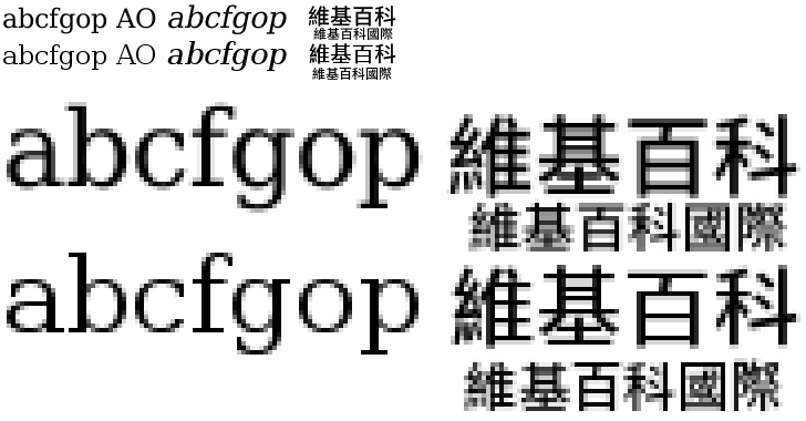
For the purpose of on-screen text display, font hinting designates which primary pixels are interpolated to more clearly render a font.
Hints are usually created in a font editor during the typeface design process and embedded in the font. A font can be hinted either automatically (through processed algorithms based on the character outlines) or set manually. Most font editors are able to do automatic hinting, and this approach is suitable for many fonts. However, high-quality commercial fonts are often manually hinted to provide the sharpest appearance on computer displays. Verdana is one example of a font that contains a large amount of hinting data, much of which was accomplished manually by type engineer Tom Rickner.[1]
Implementations
One popular and recognizable form of hinting is found in the TrueType font format, released in 1991 by Apple Computer. Hinting in TrueType invokes tables of font data used to render fonts properly on screen. One aspect of TrueType hinting is grid-fitting, which modifies the height and width of font characters to line up to the set pixel grid of screen display. The open-source FreeType 2 font rendering engine uses an auto-hinter when such hinting data are not present or their use is restricted by a software patent.[2] As of 2011, the FreeType Web site states that the relevant font hinting patents have now all expired, and hinting is now enabled in FreeType by default.[2]
Guidelines
According to the TrueType Reference Manual,[3] font instructors (those performing font hinting) must balance the following two constraints when hinting a font:
- At small sizes, chance effects should not be allowed to magnify small differences in the original outline design of a glyph.
- At large sizes, the subtlety of the original design should emerge.[3]
The Manual suggests that, for screen viewing, fonts should be readable at 9 points per em at 72 dpi. Particular attention should be paid to the cap height, x-height, and baseline, so that the font retains its normal character while not producing exaggerated effects at small sizes.
See also
References
- ↑ "Georgia & Verdana — Typefaces designed for the screen (finally)". Daniel Will-Harris. 2003. Retrieved 2010-05-24.
- 1 2 "FREETYPE & PATENTS". the FreeType Project. 2009-06-09. Retrieved 2010-01-28.
- 1 2 https://developer.apple.com/fonts/TTRefMan/RM03/Chap3.html#features TrueType Reference Manual
External links
- "TrueType Hinting". Microsoft Corporation. June 30, 1997. Retrieved November 6, 2007.
- An online font hinting tool
- The burden of locked grids & blooming dots - short video introduction to hinting by Geraldine Wade et al.
- The Raster Tragedy at Low-Resolution Revisited: Opportunities and Challenges beyond “Delta-Hinting”. Beat Stamm. March 2011. A revised and extended version of the original 1998 article covering anti-aliasing including sub-pixel rendering, opportunities made possible by anti-aliasing, challenges in the rasterizer and elsewhere, and a discussion of font hinting in the context of these opportunities and challenges.
- FreeType and Patents
- Tutorial on the DejaVu font wiki
- Texts Rasterization Exposures Article from the Anti-Grain Geometry Project.
Typography terminology | |||||||||||||||
|---|---|---|---|---|---|---|---|---|---|---|---|---|---|---|---|
| Page | |||||||||||||||
| Paragraph | |||||||||||||||
| Character |
| ||||||||||||||
| Classifications |
| ||||||||||||||
| Punctuation | |||||||||||||||
| Typesetting | |||||||||||||||
| Typographic units | |||||||||||||||
| Digital typography |
| ||||||||||||||
| Related | |||||||||||||||
| |||||||||||||||