Counter (typography)

In typography, a counter is the area of a letter that is entirely or partially enclosed by a letter form or a symbol (the counter-space/the hole of).[1][2] Letters containing closed counters include A, B, D, O, P, Q, R, a, b, d, e, g, o, p, and q. Letters containing open counters include c, f, h, i, s etc. The digits 0, 4, 6, 8, and 9 also possess a counter. An aperture is the opening between an open counter and the outside of the letter.
The lowercase 'g' has two typographic variants: the single-story '![]() ' has one closed counter and one open counter (and hence one aperture); the double-story '
' has one closed counter and one open counter (and hence one aperture); the double-story '![]() ' has two closed counters.
' has two closed counters.
Open and closed apertures
Different typeface styles have different tendencies to use open or more closed apertures. This design decision is particularly important for sans-serif typefaces, which can have very wide strokes making the apertures very narrow indeed.
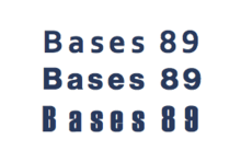
Fonts designed for legibility often have very open apertures, keeping the strokes widely separated from one another to reduce ambiguity. This may be especially important in situations such as signs to be viewed at a distance, materials intended to be viewed by people with vision problems, or small print, especially on poor-quality paper.[3] Fonts with open apertures include Lucida Grande, Trebuchet MS, Corbel and Droid Sans, all designed for use on low-resolution displays, and Frutiger, FF Meta and others designed for print use.[4] This design trend has become increasingly common with the spread of humanist sans-serif designs since the 1980s and the 1990s and the use of computers requiring new fonts which are legible on-screen.
Helvetica can’t do everything...it can be really weak in small sizes. Shapes like ‘C’ and ‘S’ curl back into themselves, leaving tight "apertures"—the channels of white between a letter’s interior and exterior... The lowercase ‘e,' the most common letter in English and many other languages, takes an especially unobliging form. These and other letters can be a pixel away from being some other letter.
Realist or neo-grotesque sans-serif fonts like Helvetica use very closed apertures, folding up stroke ends to make them closer together. This gives these designs a distinctive, compact appearance, but may make similar letterforms hard to distinguish. Closed letterforms on highly condensed realist designs such as Impact and Haettenschweiler make characters such as 8 and 9 almost indistinguishable at small print sizes. Designer Nick Shinn has suggested that the cause of this design trend, similar to the Didone serif typefaces of the nineteenth century, may have been the desire to distribute the pressure of the printing press on the type, reducing wear.[6][7]
See also
References
- ↑ Maxymuk, John (1997). Using desktop publishing to create newsletters, handouts, and Web pages (Google books (snippet view)). Neal-Schuman. p. 33. ISBN 978-1-55570-265-6. Retrieved July 19, 2009.
Counter is the white space center of enclosed letters like Bb, Dd, Pp.
- ↑ Narang, Sumita (2006). Designing Websites: According to the Ancient Science of Directions (Google books (limited prview)). Smita Jain Narang. p. 74. ISBN 978-81-207-3071-7. Retrieved July 19, 2009.
Open space in a letter is called the counter or the aperture.
- ↑ "Mercury Text: Features". Hoefler & Frere-Jones. Retrieved 28 November 2014.
- ↑ Whited, Billy. "Three Exemplary Typefaces for User Interfaces". The Typekit Blog. Adobe. Retrieved 28 November 2014.
- ↑ Covert, Adrian. "Why Apple's New Font Won't Work On Your Desktop". FastCoDesign. Retrieved 28 November 2014.
- ↑ Shinn, Nick. "Modern Suite" (PDF). Shinntype. Retrieved 11 August 2015.
- ↑ My Type Design Philosophy by Martin Majoor
Typography terminology | |||||||||||||||
|---|---|---|---|---|---|---|---|---|---|---|---|---|---|---|---|
| Page | |||||||||||||||
| Paragraph | |||||||||||||||
| Character |
| ||||||||||||||
| Classifications |
| ||||||||||||||
| Punctuation | |||||||||||||||
| Typesetting | |||||||||||||||
| Typographic units | |||||||||||||||
| Digital typography |
| ||||||||||||||
| Related | |||||||||||||||
| |||||||||||||||