Obama logo
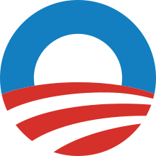
The Obama logo was the flagship symbol of Barack Obama's 2008 presidential campaign. The design became one of the most recognized political brand logos during the 2008 U.S. Presidential election, and was used again for Obama's re-election campaign.
Process
The logo was designed by Chicago-based Sender LLC (a brand development and design company) on assignment from Chicago-based Mode Project (a motion design studio). The latter had been brought on board early on by David Axelrod, Obama’s chief campaign strategist, although it had never done a political identity before. Creative director Sol Sender, now a partner at VSA Partners and founding director of the IBM Design Lab, led the design team of three which included Amanda Gentry and Andy Keene. Project managers at Mode Project were Colin Carter and Steve Juras.[1]
"We were looking at the “o” of his name and had the idea of a rising sun and a new day,” according to Sender. “The sun rising over the horizon evoked a new sense of hope."[2] "The design expression was so constrained and so bland for so many years in politics," Sender says. "I think we had a fresh approach because we’d never worked on a campaign before” — and, of course, the power of the logo had a lot to do with “the power of the candidate’s message."[3]
The final design was decided among seven or eight options in the first round.[4] "In terms of our internal process, though, I believe the logo — as we now know it — came out of a second round of design explorations. At any rate, it happened quite quickly, all things considered. The entire undertaking took less than two weeks."[5]
The design began late in 2006 and the finished logo made its debut when Obama officially announced his candidacy for president February 10, 2007 in Springfield, Illinois.[1]
John Slabyk and Scott Thomas, designers with the Obama campaign oversaw the customization of the logo for 12 different identity groups as well as for each state with 50 additional versions. There was also identity for Republicans and Independents supporting Barack Obama.[1][6]
Reception
The reception of Obama's logo was generally positive, and in some circles, highly praised. The Boston Globe beamed that "the ever-present rising sun logo has the feeling of a hot new Internet company."[7] "It begins to break with tradition while also rooting itself in tradition," said Peter Krivkovich, CEO of Cramer-Krasselt advertising agency in Chicago.[2] "Patriotism is the foundation, but above that is hope, opportunity, newness." David Morrison, president of Philadelphia-based market research firm Twentysomething Inc., said the logo has "a nice, contemporary, dynamic, youthful vibe about it."[2] Designer Michael Bierut called Obama's branding "just as good or better" as the best commercial brand designs. "Every time you look, all those signs are perfect," Beirut said. "Graphic designers like me don't understand how it's happening. It's unprecedented and inconceivable to us. The people in the know are flabbergasted."[8]
On the other hand, cartoonist Ward Sutton asked, "is it a zero and a sunset over a deserted highway?" "Too many type styles and colors. The look is left undefined. The designer may have been too inexperienced," he added.[9]
Some have noted the similarity of Obama's campaign logo to others, namely those of Vietin Bank, The Sidney Hillman Foundation, City of Chandler, Arizona, the Taiwan Solidarity Union, and the Shanghai Cooperation Organisation.[10] There is also some similarity to the European Union's Protected Designation of Origin and Protected Geographical Indication logos and the logo of Germany's Agenda-Glas AG. The official logo of the Democratic Alliance party of South Africa bears a striking resemblance to Obama's campaign logo.
References
- 1 2 3 "Sol Sender Interview on the Obama Logo". Archived from the original on 2008-12-26. Retrieved 2009-01-18.
- 1 2 3 "Chicago designers create Obama's logo". Crain's Chicago Business. 2007-02-22. Archived from the original on 2008-12-11. Retrieved 2008-12-14.
- ↑ "Design with a big O: On developing Obama's campaign identity". Minnesota Independent. 2008-12-13. Retrieved 2008-12-14.
- ↑ http://www.logodesignlove.com/obama-08-logo-design-options
- ↑ Heller, Steven (2008-11-20). "The 'O' in Obama". The New York Times. Retrieved 2008-12-14.
- ↑ "The Obama Brand: A Retrospective". Visual Culture. 2009-07-11. Retrieved 2009-01-18.
- ↑ Berlow, Sam; Highsmith, Cyrus (2008-01-27). "What font says 'Change'?". The Boston Globe. Retrieved 2009-01-17.
- ↑ "Why the Obama "Brand" Is Working". Newsweek. 2007-02-27. Retrieved 2009-01-17.
- ↑ "Reading Tea Leaves and Campaign Logos". The New York Times. 2007-11-18. Retrieved 2009-01-17.
- ↑ Erlewine, Michael Yoshitaka. "Obama for Taiwan 2008". Retrieved 2009-03-24.