Italic type
In typography, italic type is a cursive font based on a stylized form of calligraphic handwriting. Owing to the influence from calligraphy, such fonts normally slant slightly to the right. Italics are a way to emphasise key points in a printed text, or when quoting a speaker a way to show which words they stressed. One manual of English usage described italics as "the print equivalent of underlining".[1]
The name comes from the fact that calligraphy-inspired Typefaces were first designed in Italy, to replace documents traditionally written in a handwriting style called chancery hand. Ludovico Arrighi and Aldus Manutius (both between the 15th and 16th centuries) were the main type designers involved in this process at the time. Different glyph shapes from roman type are usually used — another influence from calligraphy — and upper-case letters may have swashes, flourishes inspired by ornate calligraphy. An alternative is oblique type, in which the type is slanted but the letterforms do not change shape: this less elaborate approach is used by many sans-serif typefaces.
History

Italic type was first used by Aldus Manutius and the Aldine Press in 1500, in the frontispiece of an edition of Catherine of Siena's letters[2] (although the first complete book in italic was an edition of Virgil dedicated to Italy, published the following year). According to Lynne Truss, Manutius invented the italic typeface.[3] Based on the humanist cursive script first developed in the 1420s by Niccolò de' Niccoli,[4] it served as a condensed type for simple, compact volumes.[5] The punches for these types were cut by Francesco da Bologna (whose surname was Griffo). In 1501 Aldus wrote to his friend Scipio:
We have printed, and are now publishing, the Satires of Juvenal and Persius in a very small format, so that they may more conveniently be held in the hand and learned by heart (not to speak of being read) by everyone.
Unlike the italic type of today, the capital letters were upright roman capitals which were shorter than the ascending lower-case italic letters and used about 65 tied letters (ligatures) in the Aldine Dante and Virgil of 1501. The reason for the upright capitals was that at the time upright capitals were commonly viewed as inscriptional and were often modelled on Roman stone carving.
This Aldine italic became the model for most italic types. It was very popular in its own day and was widely (and inaccurately) imitated. The Venetian Senate gave Aldus exclusive right to its use, a patent confirmed by three successive Popes, but it was widely counterfeited.[5] The Italians called the character Aldino, while others called it Italic.
The slanting italic capital was first introduced by printers in Lyon.
Examples
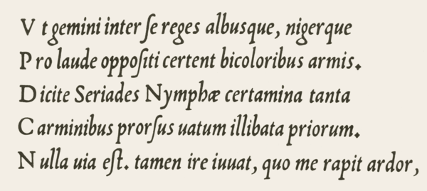
An example of normal (roman) and true italics text:

The same example, as oblique text:
Some examples of possible differences between roman and italic type, besides the slant, are below. The transformations from roman to italics are illustrated.
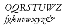
 a "round" or one-storey a,
 an e whose bowl is curved rather than pointed,
 an f with a tail (known as a descender),
 a k with a looped bowl, a k with a ball terminal,
 a p with an intersection at the stem (ascender),
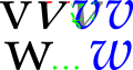 a v and w with swashes and curved bottoms,
 a z with the stress on the horizontal strokes as opposed to the diagonal vertical one.
None of these differences are required in an italic; some, like the "p" variant, do not show up in the majority of italic fonts, while others, like the "a" and "f" variants, are in almost every italic. Other common differences include:
- Double-loop g replaced by single-loop version.
- Different closing height where the forked stroke intersects with the stem (e.g. : a, b, d, g, p, q, r, þ).
- Bracketed serifs (if any) replaced by hooked serifs.
- Tail of Q replaced by tilde (as in, for example, the Garamond typeface).
Less common differences include a descender on the z and a ball on the finishing stroke of an h, which curves back to resemble a b somewhat. Sometimes the w is of a form taken from old German typefaces, in which the left half is of the same form as the n and the right half is of the same form as the v in the same typeface. There also exist specialized ligatures for italics, such as a curl atop the s which reaches the ascender of the p in sp.
In addition to these differences in shape of letters, italic lowercases usually lack serifs at the bottoms of strokes, since a pen would bounce up to continue the action of writing. Instead they usually have one-sided serifs that curve up on the outstroke (contrast the flat two-sided serifs of a roman font). One uncommon exception to this is Hermann Zapf's Melior. (Its outstroke serifs are one-sided, but they don't curve up.)

Outside the regular alphabet, there are other italic types for symbols:
- Ampersand resembles ET ligature more than the Roman version (e.g.: ITC Garamond)
- Asterisk is rotated instead of slanted (e.g.: Bookman Old Style, ITC Garamond).
- Question mark resembles a reversed Latin S.
True italic styles are traditionally somewhat narrower than roman fonts.
Usage

- Emphasis: "Smith wasn't the only guilty party, it's true". This is called stress in speech.
- The titles of works that stand by themselves, such as books (including those within a larger series), albums, paintings, plays, and periodicals: "He wrote his thesis on The Scarlet Letter". Works that appear within larger works, such as short stories, poems, or newspaper articles, are not italicized, but merely set off in quotation marks. When italics are unavailable, such as on a typewriter or websites that do not support formatting, an underscore or quotes are often used instead.[8]
- The names of ships: "The Queen Mary sailed last night."
- Foreign words, including the Latin binomial nomenclature in the taxonomy of living organisms: "A splendid coq au vin was served"; "Homo sapiens".
- Mentioning a word as an example of a word rather than for its semantic content (see use–mention distinction): "The word the is an article".
- Using a letter or number mentioned as itself:
- John was annoyed; they had forgotten the h in his name once again.
- When she saw her name beside the 1 on the rankings, she finally had proof that she was the best.
- Using a letter or number mentioned as itself:
- Introducing or defining terms, especially technical terms or those used in an unusual or different way:[9] "Freudian psychology is based on the ego, the super-ego, and the id."; "An even number is one that is a multiple of 2."
- Sometimes in novels to indicate a character's thought process: "This can't be happening, thought Mary."
- Italics are used in the King James Version to de-emphasise words "that have no equivalent in the original text but that are necessary in English.[10]
- Algebraic symbols (constants and variables) are conventionally typeset in italics: "The solution is x = 2."
- Symbols for physical quantities and mathematical constants: "The speed of light, c, is approximately equal to 3.00×10⁸ m/s."[11][12][13]
- In biology, gene names (for example, lacZ) are written in italics whereas protein names are written in roman type (e.g. β-galactosidase, which the lacZ gene codes for).[14][15]
Oblique type compared to italics
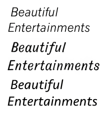
Oblique type (or slanted, sloped) is text that is slanted, but lacking the cursive letterforms of "true italics". Many sans-serif typefaces use oblique designs instead of italic ones; some have both italic and oblique variants. Professional font designers have described the effect of using an oblique as less soft and more insistent.[16][17]
Almost all modern serif fonts have true italic designs, Bookman Old Style being a notable exception.[18] Some serif designs primarily intended for headings rather than body text are not provided with an italic, Cooper Black, Engravers and some releases of Baskerville Old Style being common examples of this. In addition, computer programmes may generate an 'italic' style by simply slanting the regular style if they cannot find an italic or oblique style, though this may look awkward with serif fonts for which an italic is expected. Professional designers normally do not simply tilt fonts to generate obliques but make subtle corrections to correct the distorted curves this introduces.
Many font families, primarily sans-serif fonts, have called the oblique fonts italic, whether or not they include "true italic" characteristics.
In the late nineteenth and early twentieth centuries, a number of French and German type foundries such as Genzsch & Heyse offered serif typefaces with oblique rather than italic designs, but these designs (such as Genzsch Antiqua) have mostly disappeared.[19][20] Stanley Morison of Monotype made a late attempt to promote this style in 1925 by commissioning the typeface Perpetua from Eric Gill with a sloped roman rather than an italic, but Monotype management vetoed the original design in favour of a true italic.[21][22]
More complex usage
Italics within italics
If something within a run of italics needs to be italicized itself, the type is normally switched back to non-italicized (roman) type: "I think The Scarlet Letter had a chapter about that, thought Mary." In this example, the title ("The Scarlet Letter") is within an italicized thought process and therefore this title is non-italicized. It is followed by the main narrative that is outside both. It is also non-italicized and therefore not obviously separated from the former. The reader must find additional criteria to distinguish between these. Here, apart from using the attribute of italic–non-italic styles, the title also employs the attribute of capitalization. Citation styles in which book titles are italicized differ on how to deal with a book title within a book title; for example, MLA style specifies a switch back to roman type, whereas The Chicago Manual of Style (8.184) specifies the use of quotation marks (A Key to Whitehead's "Process and Reality"). An alternative option is to switch to an 'upright italic' style if the typeface used has one; this is discussed below.
Left-leaning italics

Left-leaning italics are very rare in Latin alphabet use, where their use is mostly restricted to occasional use where an attention-grabbing effect is sought.[23][24] They are more common in Arabic printing.

In certain Arabic fonts (e.g.: Adobe Arabic, Boutros Ads), the italic font has the top of the letter leaning to the left, instead of leaning to the right. Some font families, such as Venus, Roemisch, Topografische Zahlentafel, include left leaning fonts and letters designed for German cartographic map production, even though they do not support Arabic characters.
Iranic font style
in the 1950s Gholamhossein Mosahab invented the Iranic font style, a back-slanted italic form to go with the right-to-left direction of the script.[25]
Upright italics

Since italic styles clearly look different from regular (roman) styles, it is possible to have 'upright italic' designs that have a cursive style but remain upright. In Latin-script countries, upright italics are rare but are sometimes used in mathematics or in complex texts where a section of text already in italics needs a 'double italic' style to add emphasis to it. Complex typefaces may therefore offer them as an alternative to the default conventional italic style. Fonts with upright or near-upright italics include Jan van Krimpen's Romanée, Eric Gill's Joanna, Martin Majoor's FF Seria and Frederic Goudy's Deepdene. As a separate stylistic decision, some Arts and Crafts movement-influenced printers such as Gill copied the original italic system of italic lower-case only.[26]
Some typeface families may have alternative styles of italics for different uses. Donald Knuth's Computer Modern has an alternate upright italic as an alternative to its standard italic, since its intended use is complex mathematics typesetting. The popular book typeface Bembo has been sold with two italics: one reasonably straightforward design that is commonly used today, and an alternative upright 'Condensed Italic' design, far more calligraphic, as a more eccentric alternative.[27][28][29]
Parentheses
The Chicago Manual of Style suggests that to avoid problems such as overlapping and unequally spaced characters, parentheses and brackets surrounding text that begins and ends in italic or oblique type should also be italicized (as in this example). An exception to this rule applies when only one end of the parenthetical is italicized (in which case roman type is preferred, as on the right of this example).
In The Elements of Typographic Style, however, it is argued that since Italic delimiters are not historically correct, the upright versions should always be used, while paying close attention to kerning.
Substitutes
In media where italicization is not possible, alternatives are used as substitutes:
- In typewritten or handwritten text, underlining is typically used.
- In plain-text computer files, including e-mail communication, italicized words are often indicated by surrounding them with slashes or other matched delimiters. For example:
- I was /really/ annoyed.
- They >completely< forgot me!
- I had _nothing_ to do with it. (Commonly interpreted as underlining, which is an alternative to italics.)
- It was *absolutely* horrible. (Commonly interpreted as bold. This and the previous example signify italic in Markdown.)
- Where the italics do not indicate emphasis, but are marking a title or where a word is being mentioned or defined as a direct object, quotation marks may be substituted:
- The word "the" is an article.
- The term "even number" refers to a number that is a multiple of 2.
- The story "A Sound of Thunder" was written by Ray Bradbury.
Web pages
In HTML, the i element is used to produce italic (or oblique) text. When the author wants to indicate emphasized text, modern Web standards recommend using the em element, because it conveys that the content is to be emphasized, even if it cannot be displayed in italics. Conversely, if the italics are purely ornamental rather than meaningful, then semantic markup practices would dictate that the author use the Cascading Style Sheets declaration font-style: italic; along with an appropriate, semantic class name instead of an i or em element.
See also
References
- ↑ Truss, Lynne (2004), Eats, Shoots & Leaves: The Zero Tolerance Approach to Punctuation, New York: Gotham Books, p. 146, ISBN 1-59240-087-6
- ↑ "Roman vs Italic". Type to Print: The Book & The Type Specimen Book. Columbia University Libraries. Retrieved October 27, 2014.
- ↑ Truss, Lynne (2004), Eats, Shoots & Leaves: The Zero Tolerance Approach to Punctuation, New York: Gotham Books, p. 77, ISBN 1-59240-087-6
- ↑ Berthold Louis Ullman, The origin and development of humanistic script, Rome, 1960, p. 77
- 1 2 Updike, D.B. (1927), Printing Types: Their History, Form and Use, Harvard University
- ↑ Butterick, Matthew. "Bold or italics?". Practical Typography. Retrieved 29 July 2015.
- ↑ Butterick, Matthew. "Small caps". Practical Typography. Retrieved 29 July 2015.
- ↑ Formatting Book Titles in the Digital Age
- ↑ University of Minnesota Style Manual, University of Minnesota, July 18, 2007, archived from the original on March 24, 2010, retrieved October 22, 2009
- ↑ Norton, David (2005). A Textual History of the King James Bible. Cambridge University Press. p. 162. Retrieved 18 October 2016.
- ↑ Mills, I. M.; Metanomski, W. V. (December 1999), On the use of italic and roman fonts for symbols in scientific text (PDF), IUPAC Interdivisional Committee on Nomenclature and Symbols, retrieved 9 November 2012. This document was slightly revised in 2007* and full text included in the Guidelines For Drafting IUPAC Technical Reports And Recommendations and also in the 3rd edition of the IUPAC Green Book. *Refer to Chemistry International. Volume 36, Issue 5, Pages 23–24, ISSN (Online) 1365-2192, ISSN (Print) 0193-6484, DOI: 10.1515/ci-2014-0529, September 2014
- ↑ See also Typefaces for Symbols in Scientific Manuscripts, NIST, January 1998. This cites the family of ISO standards 31-0:1992 to 31-13:1992.
- ↑ "More on Printing and Using Symbols and Numbers in Scientific and Technical Documents". Chapter 10 of NIST Special Publication 811 (SP 811): Guide for the Use of the International System of Units (SI). 2008 Edition, by Ambler Thompson and Barry N. Taylor. National Institute of Standards and Technology, Gaithersburg, MD, U.S.A.. March 2008. 76 pages. This cites the ISO standards 31-0:1992 and 31-11:1992, but notes "Currently ISO 31 is being revised [...]. The revised joint standards ISO/IEC 80000-1—ISO/IEC 80000-15 will supersede ISO 31-0:1992—ISO 31-13.".
- ↑ "The NCBI Style Guide: Style Points and Conventions". National Center for Biotechnology Information. Retrieved 28 April 2016.
- ↑ "Guidelines for Formatting Gene and Protein Names". BioScience Writers. Retrieved 28 April 2016.
- ↑ Tankard, Jeremy. "Bliss". Jeremy Tankard. Retrieved 29 July 2015.
- ↑ "Whitney stylistic sets". Hoefler & Frere-Jones. Retrieved 29 July 2015.
- ↑ Simonson, Mark. "Bookmania". Retrieved 23 September 2014.
- ↑ "Typophile discussion". Typophile. Retrieved 8 November 2014.
- ↑ Devroye, Luc. "Friedrich Bauer". Type Design Information. Retrieved 8 November 2014.
- ↑ Monotype Imaging: Perpetua
- ↑ Lo Celso, Alejandro. "Serial Type Families" (PDF).
- ↑ William E. Ryan; Theodore E. Conover (2004). Graphic Communications Today. Cengage Learning. p. 98. ISBN 0-7668-2075-0.
- ↑ "Nitro & Turbo - Overview". Hoefler & Frere-Jones. Retrieved 29 February 2016.
- ↑ Esfahbod, Behdad; Roozbeh Pournader (March 2002). "FarsiTeX and the Iranian TeX Community" (PDF). TUGboat. 23 (1): 41–45. Retrieved 3 January 2013.
- ↑ Harling, Robert (1975). The Letter Forms and Type Designs of Eric Gill ([1st U.S. ed.]. ed.). Westerham, Kent: Published by Eva Svensson, and printed by the Westerham Press. pp. 51–8. ISBN 0-903696-04-5.
- ↑ Bixler, M & W. "Bembo Condensed Italic specimen". Retrieved 30 June 2015.
- ↑ "Fairbank". Monotype. Retrieved 30 June 2015.
- ↑ "Fairbank". MyFonts. Monotype.
- ↑ Warde, Beatrice (1926). "The 'Garamond' Types". The Fleuron: 131–179.
External links
| Look up italic or Appendix:Italic in Wiktionary, the free dictionary. |
- The Uses of Italic A Primer of Information Regarding the Origin and Uses of Italic Letters by Frederick W. Hamilton
Typography terminology | |||||||||||||||
|---|---|---|---|---|---|---|---|---|---|---|---|---|---|---|---|
| Page | |||||||||||||||
| Paragraph | |||||||||||||||
| Character |
| ||||||||||||||
| Classifications |
| ||||||||||||||
| Punctuation | |||||||||||||||
| Typesetting | |||||||||||||||
| Typographic units | |||||||||||||||
| Digital typography |
| ||||||||||||||
| Related | |||||||||||||||
| |||||||||||||||