History of the National University of San Marcos seal

Since its founding in the 1550s, the National University of San Marcos' identifying symbols changed over the years, although the main pattern has been consistently maintained.
First logo
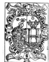
From its founding until 1574, the university's first official seal featured an icon of the "Virgen del Rosario" (Virgin of the Rosary), patron saint of the Dominican friars; at the right was a representation of the Pacific Ocean and on the bottom a lime (fruit) (that is, the fruit, which in Spanish is una lima, hence Lima, Peru).
The logo was approved by King Charles I of Spain in 1551. By the late 1570s and after a papal bull of Pope Pius V, the seal was modified, replacing the icon of Virgen del Rosario with Saint Mark. It is uncertain which colors were used on this seal, because documents in the 16th century were only black-and-white paper prints. It wasn't until 1929 when the colors—blue for the ocean, black or brown for the saint's icon, a light blue background, and silver for columns—became popular.
This logo was the longest-enduring symbol of the university: it was used for almost four and a half centuries, until the late 1980s, when it was improved for the second generation logo.
Second logo
The first logo was revised and lightly improved in the early 1990s, and it was fully improved on May 12, 1991, when university celebrated its 440th anniversary. Major changes were made to the angel's shape and its wings, but the main pattern remained unchanged. This logo gained quickly popularity, hence it survived all the decade. This seal featured the same colors as were used since late 1920s, but the black-and-white version is known by almost all graduate students of those days. This seal was improved for the third generation logo in early 2000s.
Third logo
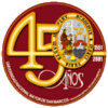
The third generation logo used today was released in early 2000s. It became official on May 12, 2001 when University celebrated its 450th Anniversary; at the same time a special logo was made for this year, which was used throughout 2001 and 2002. Since it was introduced in early 2000 this logo has been the university's official symbol, and is widely used on media advertisements.