History of BBC television idents
The history of BBC television idents begins in the early 1950s, when the BBC first displayed a logo between programmes to identify its service. As new technology has become available, these devices have evolved from simple still black and white images to the sophisticated full colour short films seen today. With the arrival of digital services in the United Kingdom, and with them many more new channels, branding is perceived by broadcasters to be much more important, meaning that idents need to stand out from the competition.
This article describes the development of the BBC's main television channels' identities.
BBC Television Service/BBC One
Pre-1969


The original BBC Television Service was launched on 2 November 1936 and was taken off the air at the outbreak of war in September 1939, returning in June 1946. As the only public television service in Britain, and initially in the world, there was no need for a station ident in the early days. However, with the imminent arrival of commercial television in Britain, 2 December 1953 saw the arrival of the first ident, nicknamed the "Bat's Wings". This was an elaborate mechanical contraption constructed by Abram Games, which featured a tiny spinning globe in the centre, surrounded by two spinning "eyes", with lightning flashes to either side. Unlike later idents, this was filmed, rather than live. The model was temperamental, and broke down shortly after it was filmed.[1] By the early 1960s the "Bat's Wings" had been superseded by the "BBC tv" logo within a circle, beneath which would appear a map of Britain split into the BBC's broadcast regions.
The channel's most famous emblem, the globe, appeared in its first guise on 30 September 1963. The first such ident featured the continuity announcer speaking over a rotating globe while a "BBC tv" caption would appear with the announcement, "This is BBC Television" being made.
The launch of sister channel BBC2 saw the channel renamed BBC1 on 20 April 1964, although the name was not changed on-screen until the introduction of the "watch-strap" globe in 1966. The reason the change was delayed was due to coverage of BBC2 being limited; BBC1 remained "BBC tv" in the meantime.
The Noddy System Mechanical Globe (1969–1985)


On 15 November 1969, BBC1 began transmitting in colour, and introduced the first version of the "mirror globe" ident. The word "Colour", identifying this new feature, was included in the station ident, and separate, more expensive colour television licences were offered. Originally, the mirror globe had a blue logo and landmasses to enhance the clarity of the image on black and white screens. In January 1972 the BBC1 ident was revised with the "Colour" identification being italicised. On 28 December 1974 the mirror globe was altered to a much friendlier blue and yellow on a dark blue background and the BBC1 logo was changed to Futura Bold typeface. The "Colour" identification was removed from the name. The trailers around this time changed as well to incorporate the Double striped BBC1 logo, which would later become part of the next ident in 1981 when the mirror globe was revised.
The globe was changed one last time in September 1981 to the double striped BBC1 logo, sitting below a lime green and blue globe on navy blue background. Also, the globe was repainted about this time, which resulted in South Africa having a pointed tip. The idents were generated by the Nexus Orthicon Display Device (abbreviated to NODD and pronounced "noddy"), which worked by filming an image in black and white and electronically adding colour before the image was aired. This made it very easy for technical crew to manipulate the colours of the image for whatever reason (like a logo revamp). This technique was also used on the clock and schools idents, which were also filmed in black and white by the same camera and had colour added later on. The camera would be set up looking at a bank of clocks, idents, globes and breakdown captions and could be turned to look at any of these idents. The black and blue mirror globe was recreated to introduce Life on Mars which itself is set in the 70's.
Up until now, a mechanical clock had always accompanied the globe.[nb 1] However, when BBC2 introduced their computerised ident, the technicians started working on an electronic clock to accompany the new looks. This was completed in 1982, and the design of the clock was changed for the first time in many years. The mechanical clocks had a "polo" mint centre with points around the clock face that increased in thickness as you went around the clock. The new electronic clocks had double line markers at 12, 3, 6 and 9, with single line markers everywhere else. The new clocks also had a single centre dot.[nb 2]
The Computer Originated World (COW) (1985–1991)

By 1985, computer graphics technology had progressed sufficiently that on 18 February the mechanical mirror globe was retired in favour of the new "Computer Originated World", or 'COW', which showed a semi-transparent blue globe with golden continents and gold "BBC1".[2] It was created by the BBC graphics and computer departments with work starting on it in 1983, following the success of the electronic BBC2 ident and the clocks.[3] The globe was originally planned to launch on 1 January 1985 but was delayed until 18 February that year by the then controller of BBC One, Michael Grade, in order to make part of a new look for the channel and a new evening line-up, including Wogan and EastEnders, as ratings began to slide. From start-up until 6:00pm that evening, the older NODD mirror globe was used. From 7:00pm until closedown that night, the newer COW globe was used. The first programme to be introduced by this new globe was Wogan, a chat show presented by Terry Wogan.[4] The COW globe went down well with the public, and changed the perception of the channel. Also, for the first time, Holding slides, trailers and promotions included the BBC1 golden logo, bringing the brand together. The COW globe also used the same clock face as before, with some changes.[nb 3] The colours had changed to a black background with blue counters and gold hands. The BBC1 was also included in the bottom. However, the centre dot was removed for some unknown reason, although it remained on the BBC1 Wales and Scotland clocks.
The Computer Originated World (Virtual Globe) (1991–1997)

The Computer Originated World was replaced on 16 February 1991 by a new virtual globe, designed by Martin Lambie-Nairn's branding agency, Lambie-Nairn, who had first made an impact with Channel 4's original 1982 ident. The idents were computer generated and were played from modified Laserdisc players and had no soundtrack. The ident consisted of a figure "1" inside a rotating transparent globe surrounded by a swirling smokey atmosphere above the BBC's corporate logo – the bold italic letters B B C within three rhomboids, above blue red and green flashes.[5] The globe doesn't look instantly like one, but land masses can be seen in the globe and their shadows can be seen on the background of the ident. The idents were "unveiled" on that week's Going Live!, the Saturday morning magazine show on Children's BBC at the time, by Phillip Schofield and Sarah Greene, although the globe already officially debuted before then. There was also a new clock that accompanied the new look which used GNAT (Generated Network Analogue Time). This clock mimicked the movement of an analogue clock, as the minute hand moved every second. The counters on the clock also changed, with alternating dashes and dots. The clock had no reference that it was BBC1, instead it had the BBC logo below the clock. The clock was modified in 1992 to a smaller size, so that the clock was the same size as the virtual globe ident.
The Balloon (1997–2002)

On 4 October 1997 the globe was dramatically updated when it left the computer to take the form of a hot-air balloon filmed over various landmarks throughout the UK (and occasionally appearing in other countries e.g. over Sydney Harbour during the 2000 Summer Olympics). The idents featured the new name of the channel: BBC One, renaming which continued across the rest of the BBC's channels, and also featured the new BBC corporate logo. The original set of idents were recorded on location, however in later versions the balloon was digitally added onto the location footage, as this was cheaper than filming the real balloon many times. Over the next two and a half years, no fewer than 59 different variations of the BBC One balloon ident were produced. From June 2000, the URL of the BBC's website, then known as BBC Online, was included in all BBC One and BBC Two idents. The globe idents also saw the introduction of Widescreen, including the first widescreen idents.
Rhythm & Movement (2002–2006)

A change in controller at BBC One saw the balloon globe icon become the shortest-lived ident package of the colour television era. The new controller, Lorainne Heggessey, made no secret of her hate for the Balloon idents, as she believed them to be slow, dull and boring and believed that they said nothing about a channel. Because of this opinion, she ordered a review of the current branding. Because of this review, after 39 years, the globe style was replaced on 29 March 2002 by new idents featuring a new multicultural theme. The relaunch also saw a new logo for the channel based upon that of BBC Two, though the logo was instead the BBC logo and the word "ONE" below it within a red box. The box style later became a common style for the BBC's channels.
The new idents were collaboratively called the 'Rhythm and Movement' idents and featured dancers at various locations dancing to different musical styles. These proved to be hugely unpopular; some viewers accused the BBC of being overtly politically correct, as one of the idents involved disabled dancers in wheelchairs, while other viewers were dismayed that the longstanding globe motif had been abandoned after 39 years. This was also the first new presentation package not to include a clock though one had been designed — it had become difficult to transmit the time accurately, given the delay introduced by satellites and digital transmission.
Circles (2006–present)

After four years, the idents were replaced themselves by a new set introduced on 7 October 2006, abandoning the overtly red colour scheme yet retaining the colour slightly less obviously as the main colour. The relaunch brought about a new channel logo once more with the box replaced in favour of a lowercase name, effectively appearing as "BBC one".
A circle motif now features as the main theme of the idents, while the content is much more diverse than previous: swimming hippos, motorcycle stunt riders, children playing "ring a roses", lit windows, surfers, football players, the moon, kites, and a red arc circling the logo.[6] The first of the new idents shown was 'Kites', appearing at 9:58 BST on 7 October. According to former channel controller Peter Fincham, the new circle motif is both a link to the classic globe icon used since 1963, and a 'nod' to the channel's heritage, as well as a symbol of unity, in the way the channel brings people together. The "Moon" and "Windows" idents were dropped in July 2008. On 2 May 2009, the circle idents were edited with shorter video sequences and new soundtracks (except "Hippos" and "Surfers").
As of 2016, this is the longest time BBC One has ever stayed with one era of idents without changing.
BBC Two
Launch Ident (1964–1967)

BBC Two is the second BBC channel and the third channel to air in the UK. Following the success of BBC tv, the third channel was awarded to the BBC. Following this, the BBC planned a brilliant night's entertainment for their opening night. However, the opening extravaganza was forced to reschedule from 20 April 1964 to the following evening, as the result of a massive power failure in west London.
The channel's first logo was an animation where white and grey stripes flew in from the left and right before a "2" and the BBC corporate logo flew in from the top and bottom. The jingle that accompanied the ident was a fanfare based on the morsecode translation of 'BBC TWO', composed by Freddie Phillips. This logo lasted three years until the introduction of colour to BBC2. Along with the ident, there was also a flip card with a larger 2 on it that was used as a sting in many ways. Continuity was also frequently live in vision, with the announcer in a studio with BBC2 branding.[nb 4]
The Cube (1967–1974)
For the introduction of the first British colour broadcasting service in 1967 there was no new ident, but a new logo: a 2 with a dot inside the figure. There was originally a test period where the original presentation was used with possible electronic colour added. However, it was rejected and a new ident used. This ident was formed from the 3 light spots that come together to make the central dot. From there, a 2 is drawn around the dot. Once complete, the colour legend appears below before the 2 starts rotating slowly. The blue 2 rotates to reveal a red 2, green 2 and a white 2. The ident would continually spin after this. In 1969, when BBC1 launched its own colour service, the ident was updated to match BBC1's presentation. The 2 was now all white on a blue background, with the BBC2 logo underneath the 2. The clock that went alongside this look was originally a traditional clock face with Roman numerals[nb 5] before it was changed to a light blue clockface on a dark blue background with BBC2 legend below. This clock also had the 'polo' mint centre and was filmed on BBC2's NODD, black and white camera filming the clock with colour added later on.[nb 6]
The Stripes (1974–1979)

A facelift occurred in December 1974, with the "2" being formed of blue and white lines, the different colours leaving and entering from opposite sides of the screen. This was formed from a mechanical model of 23 discs, each with an alternating colour line on them. The model was then run so that each disc spun a different way to the disc above and below it. This was the last mechanical model used on BBC2. The clock for this era was the same as the last era.
The Computer Generated 2 (1979–1986)
In mid-1979, BBC2 adopted the world's first computer-generated ident, with the logo being drawn live every time it was played.[nb 7] This version of the 2 had orange double lines either side and the 2 itself was cream double lined. This stripy 2 had been used on promotions and holding slides for years prior to its launch, and now it was part of a bigger branding package. For the first few years of the ident, it would be accompanied by a fanfare as it scrolled onto the screen. There were versions of the ident where the ident scrolled on, scrolled off and remained static. The clock used alongside this high tec 3D ident, was anything but. The old clock filmed from the NODD room survived, with a new 2D logo and sporting black and orange colours.[nb 8] However, in 1980, BBC2 got its own electronic clock including 3D legend and centre dot.[nb 9]
The TWO (1986–1991)
In 1986, the electronically generated 2 was replaced with the letters T W O. The letters were on a white background, and themselves were more 3D versions of the white background. However, the T had some red on it and the W had green and blue on the diagonal parts. These colours are reminiscent of the light spots and the colours of the dotted 2 in 1967. As with the previous ident, the TWO would fade into and out of the white background. All of this was an effort to make the channel appear more "highbrow".[8][9]
The 1991 2s (1991–2001, 2014–present)

The channel's association with the Lambie-Nairn branding agency began in 1991 following on from when Alan Yentob became controller of BBC2 in 1987. Upon taking up office, Alan realised that a review needed to be carried out of the TWO. The research carried out a start of the review found that viewers saw the TWO as "dull" and "Old Fashioned", with it having a highbrow effect. To rectify this, Lambie Nairn was hired to create a new identity. The 1986 ident was replaced by the start of the highly successful[10] series of idents involving a sans serif '2'. The idents themselves were very simple, such as Paint or Water and this changed people's perception of the channel, despite the fact that only the idents had changed. These new 2's had corporate branding on BBC2 for the first time, allowing cross channel continuity to be easily done. It also brought a unified feel to the channel. These new idents also changed the style of idents. Previously the ident was a single scene that would introduce all types of programmes. The fact that there were multiple idents allowed variation (at one point, there were 40), and for different idents to introduce different genres of programme. Also, special idents were created for themed nights and for special events such as Christmas. A sure sign of success for these idents is that they survived the rebrand following the new BBC corporate logo in 1997. The idents simply displayed the new logo, while more idents were added to the batch.
The clock that accompanied both of these looks was a slick circular clock face on a fading white and viridian background, with a combination of dots and dashes as its counters. It was never edited throughout the entire run of this series of idents.
On 19 November 2001, the idents were withdrawn.
During late 2013 and early 2014, BBC Two England and BBC Two Northern Ireland resurrected a selection of these idents (together with some of the former idents) as part of their 'Afternoon Classics' segment. BBC Two Wales also broadcast "Powder" during the 50th Anniversary of BBC Wales. As of August 2014, some of the set have come back semi-permanently for the 50th Birthday of the channel in all regions. On 1 January 2015, BBC Two was rebranded with the 1990s idents returning as the only idents in use after a short break during the Christmas season. The 2015 rebrand consists of the 1991–2001 idents, but they now have the BBC Two 50 Years box replaced with BBC Two's regular teal-coloured box logo. However, BBC Two Northern Ireland airs the idents with the BBC Two Northern Ireland logo in the centre of the idents with the box removed.
The Personality 2s (2001–2007)

After nearly eleven years, the channel received a new look on 19 November 2001 with a set of robotic figure 2s, each displaying individual personalities. This set was also produced by Lambie-Nairn, and American visual effects technician Mic Graves served as a co-creator along with Martin Lambie-Nairn, who also created the previous set. BBC Two also became the first BBC channel to receive the new style of logo, in its case this was a purple box with the BBC logo stacked above 'TWO'.[11] At the time, the channel stuck out as being different, because all the other channels still had their 1997 branding. Also, rather than a variety of backgrounds seen in the previous presentation package, idents now had a universal yellow background while the figure 2 became 3D and white. In addition to this, only 4 were originally produced, limiting the different options. Also, no clock was produced for this look, the first look not to have one. The general style of white 2 and yellow background was occasionally replaced by previously withdrawn idents from the 1991–2001 package, but also by some specially produced idents to highlight particular shows or programming strands.[12] Examples included an updated dog 2 to advertise the channel's "pedigree comedy" trailers while previously withdrawn idents have included "Predator/Venus Fly Trap" used to introduce the Chelsea Flower Show, as well as the Christmas 2000 ident which resurfaced to introduce coverage of the 2006 Winter Olympics.[12] In celebration of the channel's 40th anniversary in 2004, a special ident combining glimpses of previous BBC2 idents was used. The BBC Radio 4 logo introduced in 2001 was quite similar to what could be seen in these idents, with a white 3D number, this time being a 4. The background was blue and purple, however, and not white. This Radio 4 logo was in use in the same period as the Personality idents.
The 2007 2s (Window On The World) (2007–2014)

On 18 February 2007 the channel's presentation package was relaunched with the introduction of idents designed by advertising agency Abbott Mead Vickers BBDO and produced by Red Bee Media, costing £700,000 in total. Controller of BBC Two Roly Keating said, "These new idents embody all of BBC Two's distinctive humour, creativity, playfulness and surprise — and they're also beautifully-executed pieces of film-making in their own right".[13][14] Entitled "Window on the World",[14] these new idents feature a cut-out '2' made from various materials behind which different scenes can be seen. In addition, the on-screen presentation system and the BBC Two website have also been altered to reflect the new theme. This new look was also the first time that the 2 was altered from Lambie Nairn's original 2, however, the difference is minor and to many unnoticeable. During March 2013, the audio was replaced with new audio to coincide with the launch of BBC Two HD. During late 2014, the idents become scarcely used before being discontinued entirely on 31 December 2014.
BBC Choice/BBC Three
BBC Choice

BBC Choice was launched in 1998 as part of the BBC's aim of expanding into Digital TV. BBC Choice started out as being the home for programmes that would complement those being shown on BBC One and BBC Two. As a result of this, Lambie-Nairn - the branding agency who designed all the BBC Choice looks - used three different objects which all shared a common theme or word.
In July 2000, BBC Choice's remit was altered by the BBC to be aimed towards the young adult audience, and as a result the idents were changed. The new package featured one of the heart shapes at the centre of a brightly coloured screen, from which other heart shapes may form with different background colours inside.
In mid-2001, later on in the channel's life, the channel adopted the 3 orange boxes that would become infamous with the channel. These three orange boxes would be seen moving around an initially green, becoming blue a few months into the look, background.
At the time of the closure of BBC Choice, and the adoption of BBC Three, the idents were adapted once more. At first, the familiar orange boxes could be seen being demolished by a wrecking ball in the final months, and come December 2002, the whole identity was changed to a building site, complete with two builders.
BBC Three


The young-adult oriented BBC Three was launched on 9 February 2003, as the successor to BBC Choice. The official launch night revealed the towering three-dimensional figure "THREE" populated by small computer generated "blobs", given voices from the BBC Sound Archive. The channel logo featured a large slanted Three, below the BBC logo inside a box.
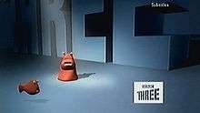
In 2008, BBC Three controller Danny Cohen unveiled a new brand for the channel, created by Red Bee Media, and designed to emphasise its new focus on cross-platform programming. The idents were introduced on 12 February 2008. The BBC logo is viewed as a pipe with pink liquid passing through it, spelling out the 'three'.[nb 10] These pipes, or pools of liquid are present in most of the idents, as are large objects that appeal to the young adult audience, or features technology such as television screens.
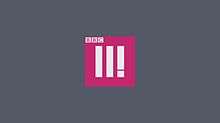
The new idents and presentation style were introduced on 1 October 2013, retaining the logo from 2008. The idents follow the theme of "discovery", and were designed by Claire Powell at Red Bee Media.[15] The soundtrack for the idents was composed by Chris Branch and Tom Haines at Brains & Hunch.[16] In 2016, the logo was changed to two pillars and an exclamation mark to promote its move to online only.
BBC Knowledge/BBC Four
BBC Knowledge

BBC Knowledge was launched in 1999 with the intent of creating a multimedia learning channel. The initial identity consisted of cartoon characters, illustrated by Michael Sheehy, against an orange background and climbing 'ladders of learning'. Individual idents for standard section were used for a time which featured an object, a fact about it and ends with a letter encircled at the centre of the screen. It is unclear whether these idents were replacements of the animated idents, or complementary to them. Following the relaunch in 2000 and 2001, all different idents were dropped in favour of a single ident, featuring numerous circles made out of different structures reflecting the new strands.
BBC Four

BBC Four was launched on 2 March 2002. The channel's first series of idents were dynamic and reacted to the frequencies of continuity announcers' voices or background music. As a result, no idents were ever the same, however variations were produced featuring different visualisations, such as semi circles, vibrating lines or shafts extending from the bottom surface. The channel also utilised a black box logo which was placed in the bottom right corner of the screen.[17]

A new set of idents designed by Red Bee Media were introduced on 10 September 2005. These begin with one apparently normal image that breaks into four quarters, each showing a different view or reflection of the other. The screen sections are divided, so the child in a library may climb up a ladder from the bottom left section, and end up in the top right segment. The music used is almost exactly the same in all idents.[17] They have had the longest lifespan out of all the BBC idents.
BBC News
BBC News 24/BBC News Channel
The BBC News channel was launched as BBC News 24 at 17:30 GMT on Sunday, 9 November 1997 as the BBC's domestic 24-hour news channel and sister to BBC World. Between 1997 and 1999, the channel used idents based upon fictional flags as also used by BBC World albeit with different music. Both channels used the simple logo, featuring the BBC logo and the brand name, at the bottom of the screen with the ident emphasis on the flags.

A problem with BBC News output at the time, was that it was very much fragmented with different brands. BBC News bulletins, BBC Breakfast News and BBC News 24 all had separate identities. To solve this, a major relaunch of all BBC News television output, with the exception of Breakfast News, in 1999 saw the channel adopt a common theme with the rest of the BBC's main news bulletins. The redesign involved a new cream and red colour scheme together with a large numeral, representing the time of the bulletin on the domestic bulletins, but replaced with '24' for the channel, as well as a variation on the new musical composition by David Lowe.

In 2003 the channel was again relaunched with a new common BBC News style featuring a deep red and black globe and background with bright white lettering. The top of the hour sequence incorporated the first news headline into ribbons that formed part of the BBC News ident style. The first look featured a '24' numeral made out of lines bending in on screen, and was more of a cream colour than the white used by other bulletins: this was rectified in 2004.

An update to the BBC's graphics and playout systems in January 2007 also introduced new graphics for BBC News 24 and the news bulletins on BBC One. The new titles had the same look, feel and background reasoning as the previous but had been filmed again with new effects, while the graphics used maintained the previously introduced colour scheme. The new idents featured glossier graphics and rendering, with the ribbons being seen formed from different angles on the globe.
On Monday, 21 April 2008 at 08:30 GMT, BBC News 24 & BBC World were renamed as "BBC News" & "BBC World News" with an updated look to match that used by all BBC news output.
BBC Parliament

BBC Parliament took over from the cable-only Parliamentary Channel on 23 September 1998.
The channel's first on-screen branding featured the single line BBC Parliament logo over a background similar in style to water and accompanied by an orchestral musical score. This branding lasted until 2002, when it was replaced by a rotating spiral with regular teeth on the outside. As part of the sequence, occasional pulsating rings are emitted and the soundtrack is in a similar style to the David Lowe BBC News theme.
The channel took on a variation of the corporate BBC News theme in 2009 with a new ident, featuring a series of cogs moving about in place of the world in the BBC News look. The cogs have a predominantly red look to them and was designed to be an interpretation of the inner workings of Parliament. It mirrors elements of the BBC News presentation, indicating it is similar to, but not part of BBC News output.
BBC World News

BBC World News, the BBC's international 24-hour news and current affairs channel was launched on 16 January 1995 at 8.00pm. The channel has shared a common appearance with domestic news channel BBC News 24 since 1997, when both used the fictitious flags idents with different music. Following the major BBC News relaunch in 1999 across all output, the channel received an individual style based upon the theme introduced with music composed by David Lowe. These idents featured similar music, and a red ident using the rotational element, and also included rings in the design.
A subsequent relaunch of BBC News bulletins came in 2003 with new graphics and titles, produced by designers within the BBC itself. This design was subsequently updated in 2007. In both of these cases the design was the same as the idents and titles used by their counterparts in BBC News 24 and in BBC News as a whole. In April 2008 as part of a major £550,000 relaunch of BBC News output by Lambie-Nairn, BBC World became 'BBC World News' and was updated in its look to match that used by all BBC news output, and the BBC News Channel. BBC Arabic Television adopted a similar look in November 2009.
CBBC
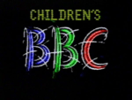

CBBC was originally launched as Children's BBC in September 1985 as a strand of programming for children aged 6–13. The first idents consisted of Children's on top of a large BBC is a similar style to a rushed scribble, generated live on air by a BBC Micro computer. However, 2 years after launch, the idents were replaced by an animated sequence of the letters spelling out Children's with an outline of an object corresponding to that letter. This was replaced by a computer generated sequence in 1990.
In 1991, the BBC corporate revamp meant that Children's BBC was given a makeover. The result was a logo centred on a stylised Children's with a corporate BBC logo at the bottom of the screen. In 1994, the Children's BBC idents changed in style; many featured cartoons or computer generated graphics where the stylised Children's and the BBC corporate logo would feature somewhere.
Children's BBC was officially renamed CBBC in October 1997, with the production of appropriate idents. The idents all had a yellow background, and black subjects and often in the cartoon style. When CBBC was given its own channel on the digital terrestrial platform on 11 February 2002, the CBBC "blob" ident was created. These animated 'bugs' were designed by Lambie-Nairn, and were always green in colour. The blob was later refreshed and given a 3D appearance in 2005.
CBBC relaunched again in the autumn of 2007, with a new logo revolving around the letters of CBBC, each in a different style. A new set of idents followed these up, revolving around scenes including each of the 4 letters before coming together at the end. These scenes could involve cartoon figures, or stars of current CBBC programmes. In 2010 the logo was updated to look more 3D. These idents were changed on 13 September 2014.
CBeebies/CBBC
CBeebies was launched on the same day as the CBBC Channel: 11 February 2002, with an original age range of pre-school children only. Following changes within the BBC Children's department, this changed to ages up to 6, with CBBC targeting ages 8 to 12.
The idents for the channel, designed by Lambie-Nairn, are the same as at launch and consist of yellow blobs, the opposite to the green blobs launched with the CBBC Channel with a much younger feel, as befits the target audience. The yellow blobs were also seen in BBC Kids' current idents. They directly oppose the CBBC blobs, as these blobs are gentle in their actions and to look at, whereas the green CBBC blobs looked more outgoing and violent - one of the CBBC idents at the time involved karate.
See also
- BBC One 'Virtual Globe' ident
- BBC One 'Balloon' idents
- BBC One 'Rhythm & Movement' idents
- BBC One 'Circle' idents
- BBC Two '1991-2001' idents
- History of ITV television idents
- Logo of the BBC
- List of BBC test cards
Notes
- ↑ Flash recreations of the 1969 BBC1 clock, the 1974 BBC1 clock, and the Original 1981 BBC1 clock can be seen on the BBC's website.
- ↑ A Flash recreation of the electronic 1981 BBC1 clock can be seen at 625.uk.com.
- ↑ A Flash recreation of the 1985 BBC1 clock can be seen at the BBC's website.
- ↑ TVARK's BBC Two 1964 Pages Includes a video of the idents, images of the in vision set and a video of (the second!) opening night.
- ↑ A Flash recreation of this clock can be seen at the BBC's website.
- ↑ A Flash recreation of this clock can be sen at the BBC's website.
- ↑ The BBC2 network logo was derived from a box called a Run Length Video Generator designed by BBC engineers.[7]
- ↑ A Flash recreation of this clock can be seen at the BBC website.
- ↑ A Flash recreation of this clock can be seen at 625.uk.com.
- ↑ Stills of the idents can be seen at The Ident Gallery.
References
- ↑ Elen, Richard G. (1 December 2003). "Oh, that Symbol...". Transdiffusion.
- ↑ Luxton, Simon. "BBC1 – Idents 1985". TV Ark. Archived from the original on 26 May 2007.
- ↑ Wiseman, Andrew (3 April 2006). "BBC 1 1985 – A Computer Originated World".
- ↑ "BBC One February 1985-February 1991". The TV Room.
- ↑ Luxton, Simon. "BBC1 – Idents 1991". TV Ark. Archived from the original on 26 May 2007.
- ↑ BBC Press Office (26 September 2006). "BBC ONE launches new channel identity" (Press release).
- ↑ "Coded Equipment Register". BBC. 1987. p. 141.
- ↑ "BBC Two April 1986-February 1991". The TV Room.
- ↑ "BBC Two January 1989". ajs41 on YouTube.
- ↑ "BBC Two February 1991-October 1998". The TV Room.
- ↑ "BBC Two November 2001-February 2007". The TV Room.
- 1 2 "BBC Two November 2001-February 2007 – Special Idents". The TV Room.
- ↑ BBC Press Office (13 February 2007). "BBC Two's new "Window on the World"".
- 1 2 "TV on the television: The new BBC Two idents". idents.tv. 19 February 2007.
- ↑ "BBC Three". Red Bee Media. October 2013. Retrieved 16 November 2013.
- ↑ "BBC Three Idents". YouTube. Red Bee Media. 9 October 2013. Retrieved 16 November 2013.
- 1 2 "BBC Four Idents". TVARK. Retrieved 31 July 2011. Contains videos of the idents.
External links
| Services | |||||||||||||||
|---|---|---|---|---|---|---|---|---|---|---|---|---|---|---|---|
| Management |
| ||||||||||||||
| Divisions | |||||||||||||||
| Nations and regions |
| ||||||||||||||
| Commercial subsidiaries | |||||||||||||||
| History | |||||||||||||||
| Key properties (full list) |
| ||||||||||||||
| Finance | |||||||||||||||
| Projects | |||||||||||||||
| |||||||||||||||
| UK channels | |
|---|---|
| Joint ventures and international channels |
|
| Services and programming blocks | |
| UK Nations/regions | |
| Defunct channels |
|