List of typefaces designed by Frederic Goudy
The following is a list of typefaces designed by Frederic Goudy.
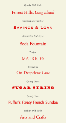
Goudy was one of America's most prolific designers of metal type. He worked under the influence of the Arts and Crafts movement, and many of his designs are old-style serif designs inspired by the relatively organic structure of typefaces created between the fifteenth and eighteenth centuries, following the lead of earlier revivalist printers such as William Morris.[1] Eric Sloane, who was his neighbour as a boy, recalled that he also took inspiration from hand-painted signs.[2] He also developed a number of typefaces influenced by blackletter medieval manuscripts, illuminated manuscript capitals and Roman square capitals carved into stone.[3] This means that several of his most famous designs such as Copperplate Gothic and Goudy Stout are unusual deviations from his normal style.[4]
Goudy's taste matched a trend of the period, in which a preference for using mechanical, geometric Didone fonts introduced in the eighteenth and nineteenth century was being displaced by a revival of interest in the 'old-style' serif fonts (preferred by Goudy) developed before this, a change that has proved to be lasting, especially in book body text.[5][6][7][8]

Again unusually for type designers of the period, Goudy wrote extensively on his work and ambitions, partly in order to publicise his work as an independent artisan. He completed A Half-Century of Type Design and Typography, a two-volume survey of all his designs, late in life, in which he discussed all of his work.[9][10] Not all Goudy's designs survive or have been digitised: several, often designs never cut into metal, were lost in a fire which burned down his studio in 1938. Indeed, in his autobiography Goudy sometimes said he had little memory of some of his earlier designs. He worked extensively with his wife Bertham, who particularly collaborated with him on printing projects. He listed his typefaces with numbers in a similar way to the opus numbers used by composers.
Career
Unlike most type designers of the metal type era, Goudy worked as an independent designer not permanently employed by any one company, giving him particular latitude to work on his own projects. He generally avoided sans-serif designs, though he did create the nearly sans-serif Copperplate Gothic, inspired by engraved letters, early in his career and a few others later. As an independent artist and consultant, Goudy needed to undertake a large range of commissions to survive, and sought patronage from companies (and, especially later in life, universities) who would commission a typeface for their own printing and advertising.[12] This led to him producing a large range of designs on commission, and promoting his career through talks and teaching.[1][13] As a result, many of his designs may look somewhat similar to modern readers.
Goudy's career took place at a time of progress in printing technology. New pantograph engraving technology made it easier to rapidly engrave matrices), the moulds in which metal type would be cast or the punches used to stamp them in copper.[14] This gave much cleaner results than pre-pantograph punches, which had to be carefully hand-carved at the size of the desired letter, with less difficulty and the ability to prepare designs more easily from large plan drawings.[15]
During the early years of Goudy's career, hand typesetting was being superseded, especially for body text composition, by hot metal typesetting, and his client Monotype was one of the most popular manufacturers of these systems, in competition with that of Linotype. Both allowed metal type to be quickly cast under the control of a keyboard, eliminating the need to manually cast metal type and slot it into place into a printing press. With no need to keep type in stock, just the matrices used as moulds to cast the type, printers could use a wider range of fonts and there was increasing demand for varied typefaces. However, many of Goudy’s designs were used in hand-setting also.
While most of Goudy's designs are 'old-style' serif faces, they do still explore a wide range of aspects of the genre, with Deepdene offering a strikingly upright italic, Goudy Modern merging traditional old-style letters with the insistent, horizontal serifs of Didone faces of the eighteenth and nineteenth centuries and several such as Goudy Old Style being sold with a swash italic for display use.[16][17] His sans-serif series, Goudy Sans, adopts an eccentric humanist style with a calligraphic italic.[18][19] Quite unlike most sans-serif types of the period, it was unpopular in his lifetime but has been revived several times since by both LTC and ITC.[20][21][22]

Goudy started his career as a full-time type designer later in life, creating his first font in his early thirties.[23] In his earlier career he had worked first as a bookkeeper, and then as a printer and lettering artist.[24]
Critical assessment
The printer Daniel Berkeley Updike, while respecting some of his work, echoed Goudy's student Dwiggins' comment that his work lacked 'a certain snap and acidity'.[25][26][27][lower-alpha 1] He also wrote that Goudy had "never gotten over" a desire to imitate medieval books.[28]
The British printer Stanley Morison, also a veteran of fine book printing whose career at Monotype had moved in the direction of blending tradition with practicality, admired much of Goudy's work and ethos but wrote that Goudy had "designed a whole century of very peculiar looking types", and that he was glad that his company's Times New Roman did not look "as if it has been designed by somebody in particular - Mr. Goudy for instance."[29] Goudy felt in his later life that his career had been overshadowed by new trends, with modernism and a trend towards sans-serifs and sharp geometric type leaving his work out of favor.[30]
Goudy gave his blackletter designs the adjective text, short for 'textura'. This designation was common in Goudy's time; it is now avoided due to confusion with fonts intended for body text.
Typefaces designed by Goudy
In the following list, italics are listed where Goudy created them, and in some cases other complementary designs completed in a family by designers other than Goudy. Links are given to digitisations, though it should be noted that many revivals may add complementary italics and/or bold weights, even if Goudy never designed one. As many early digitisations were relicensed, several of these may represent the same digitisation marketed by different rights-holders, possibly upgraded with modern features such as contextual ligature substitution and small caps.
1896 to 1904
- Camelot (1896, Dickinson Type Foundry), Goudy designed only the capitals, lower-case letters were later added, presumably by Dickinson's type designer Joseph W. Phinney or his team. A delicate Art Nouveau-inspired display face with small wedge serifs.[31]
- Unnamed (1896) this was a second set of drawings sent to Dickinson Type Foundry that he sent them after they had accepted Camelot. It was neither accepted nor cast, but Goudy numbered it among his faces.
- Display Roman (1897, nc), based on some lettering in an issue of the British magazine The Studio. Goudy numbered it among his designs, though even he was unsure of what exactly it was beyond being "a display letter leaning to the bold side" or if it had ever been manufactured.
- DeVinne Roman (1898, Central Type Foundry, ATF), a book face based on a display type that had been earlier commissioned by Theodore Low De Vinne.

- Pabst Old Style or Pabst Roman (1902, ATF), based on hand lettering done by Goudy for advertisements for the Pabst Brewing Company, though commissioned by Schlesinger & Mayer, a Chicago department store. Cast by ATF with the proviso that the department store would have the exclusive use of the font for a time before it would be offered to the public. The design had a strikingly low x-height.[32]
- Pabst Roman Italic (1903, ATF), a companion to the above. Cut by Robert Wiebking, who would work extensively with Goudy in the following years.

- Powell (1903, Keystone Foundry), commissioned by one Mr. Powell, then advertising manager for Mandel Brothers department store (earlier he had commissioned Pabst Old Style for another store), and named after him.[33] Another display type, partially inspired by lettering Goudy had done for the children's book Mother Goose, a design which Goudy felt had been pirated by the Inland Type Foundry as their font 'Hearst'. To give the font a different colour to Pabst or the 'Hearst' font, Goudy attempted to balance the x-height and height of the ascenders and descenders differently.
- Goudy reported in his autobiography that Keystone later created a matching italic.
- The Village series was a family named after Goudy's own Village Press, which came to use it.
- Village (1903, Wiebking, Harding & Co.[34]), cut by Wiebking. It was originally designed for Kuppenheimer & Company for advertising use, who later decided it would be too expensive to cast, and later bought by Frederick Sherman. The design was very much under the influence of William Morris's 'Golden' type, itself influenced by the 1470s printing of Nicolas Jenson, as well as other (mostly British) fine printers such as the Doves, Montaigne and Merrymount presses. The matrices are still extant and cast by Dale Guild Foundry.
- Village No. 2 (1932, Continental, later Lanston Monotype), cut by Goudy for an edition of Theodore Low De Vinne's The Old and the New, later marketed by Monotype.[35][36]
- Village Italic (1934, Continental + Lanston Monotype), cut by Goudy. A companion to the No. 2 face.
- Chushing Italic Goudy thought that Clarence C. Marder asked him to draw an italic to complement ATF's existing Cushing Roman sometime after 1904. However, Goudy was unsure whether they ultimately used his design, and ATF catalogs show it as existing as early as 1898.
- Barron's Boston News Letter (1904, ATF), a private face cut for Clarence W. Barron's financial newsletter, matrices cut by Wiebking. Goudy wrote in 1946 that he had no knowledge of what became of the design and little memory of what it was.
- Engravers' Roman (1904, nc), inspired by copperplate engraving. Goudy was uncertain if this type had ever been cast.
_(14593742618).jpg)
- Copperplate Gothic (1905, ATF), originally designed for Marder, Luse, & Co., ATF immediately adopted it and made it the first in a hugely successful series: Clarence C. Marder and Morris Fuller Benton later cut dozens of variations for ATF. 'Gothic' was a contemporary term for sans-serif typefaces; it has nothing to do with 'gothic' or blackletter writing.
Master printer J.L. Frazier, no great fan of sans-serif types, wrote of it in 1925 that it was a popular choice for the stationery of professionals such as lawyers and doctors: "a certain dignity of effect accompanies...due to the absence of anything in the way of frills."[37][lower-alpha 2]
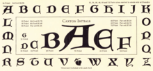
- Caxton Initials (1905, ATF), a font included twenty-six 'Lombard capitals' and one leaf ornament only.

- Globe Gothic Bold (1905, ATF), a companion to Morris Fuller Benton's 'Globe Gothic'. Sans-serif design with variable stroke width.[38] Utterly unlike Goudy's normal work, and created on commission. Goudy wrote that it "is the least satisfactory (to me) of all my types. Phinney paid me a sum that at that time I considered liberal, and I have never been able to free my mind from the suspicion that he wished to help me financially more than he required such a type for his foundry…Gerry Powell of A.T.F. insists that it sold in considerable quantities, but I have never come across many pieces of printing showing it."
- Caslon Revised (1905, never cast), for A.T.F. Caslon was a very popular typeface in the American printing of the period, becoming almost a genre with many derivatives and expansions. Clarence Marder of A.T.F. asked Goudy to draw a more regular version of the design, intended to have a more even colour on the page than the original design. Ultimately never cast.
- Goudy Light Roman + Italic (1908, Lanston Monotype), originally made for use in Life magazine (who, Goudy reported, ultimately never used it) and initially called "Monotype 38E" after its order number. Sometimes known as Gimbel because of its use in ads for Gimbel's Department Store.[39] An elegant design, which Goudy described as better-adapted for advertising and display use than for body text.
- Norman Capitals (1910, privately cast by ATF), cut for Munder-Thompson Company, a Baltimore printing firm, and named for Norman Munder. Goudy was unsure what became of the font, although he held a specimen of it and reproduced it in his memoir.
1911 to 1926

From 1911 to 1926 (with a few exceptions) Goudy's designs were cut by Robert Wiebking. Some were private commissions, others were cut first and then offered for sale.
Kennerley series
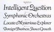
The Kennerley Series, named for New York publisher Mitchell Kennerley, was Goudy's first major success in his own style.[40]
Goudy described the design as very loosely based on the 'Fell Types', a set of type in the Dutch style collected by Bishop John Fell of Oxford for the Oxford University Press: "comparison of my type with the Fell letter will disclose little more than an identity of spirit."[41] It has also been compared in some details, notably the tilted understroke on the 'e' to the type of late 15th century Venetian printer Nicolas Jenson.[42] Many revivals and digitisations have been released since.[43][44]
- Kennerley Old Style (1911, Village Letter Foundry + 1920, Lanston Monotype + 1927 Continental)

- Kennerley Italic (1918, Village Letter Foundry + 1920, Lanston Monotype + 1927 Continental)
- Kennerley Bold + Bold Italic (1924, Lanston Monotype + Continental)

- Forum Title (1911, Lanston Monotype), capitals only, based on the lettering on the Arch of Titus in the Roman Forum.[45][46][47] Distinguishable from some of Goudy's other Roman-inspired fonts by the Greek-inspired curving capital 'Y' in the tradition of the Greek letter upsilon.[lower-alpha 3]
- Sherman (1912), privately cast for publisher Frederick Sherman who disliked it and never used it. Goudy retained a proof which he reproduced in his memoir.
- Goudy Lanston (1912, Village Letter Foundry) Initially named 'Goudy Old Style', but in 1915, when ATF requested this name for his new face for them, Goudy agreed and renamed it. 26 Lead Soldiers noted that "Goudy's own Village Foundry was long the sole source of this face, 14-point roman only". When Lanston Monotype bought and issued the face, it was again renamed, in honour of Tolbert Lanston; it was originally called Goudy Antique. Issued in England, with some alterations, by Caslon under the name Ratdolt. Evidently, this altered English version, was issued under the names Foster and Moore by Barnhart Brothers & Spindler along with a "matching" italic (see below).
- Goudy Roman (1914), originally designed for Louis Orr of the Bartlett Press who was supposed to have them cast by Caslon Foundry, but Caslon refused to take on new work due to a "war scare". Later, Barnhart Brothers & Spindler expressed interest in the project cut trial matrices, which Goudy did not like, so he eventually cut the matrices himself. It is unclear if the type was ever cast in quantity.
- Klaxon (1914, cut for Klaxon Auto Warning Signal Company), the matrices, which were cut by Wiebking, were lost in Goudy's 1939 studio fire.
- Goudy Italic, a companion to Goudy Roman which never progressed past initial drawings which were then destroyed in Goudy's 1939 studio fire.
1915 to 1926: Cut by ATF


In 1915 and 1916, Goudy was on retainer for American Type Founders and all of his matrices were cut in house by ATF.
Goudy Old Style
Described as 'an instant best-seller' by Lawson in Anatomy of a Typeface, Goudy Old Style (1915) has remained popular since its creation for ATF as a boy text and display face.[52] Goudy described the design as influenced by capitals on a painting, but later said he was unable to find which, although he thought it was by Hans Holbein (Goudy did not say which). The dots (tittles) on the 'i' and 'j' are diamond-pattern, and the descenders were kept short at ATF's insistence to allow tight line setting on their common line system.[51] Many revivals have been released.[53][54] Goudy later also designed an italic, and A.T.F. a bold weight and a medium, named 'Goudy Catalogue'.
Goudy Old Style became particularly commonly used for display and advertising use. Indeed, in 1937, the printing textbook 26 Lead Soldiers described the bold as 'better known' than the regular.
- Goudy Cursive (1916, ATF): a set of swash capitals and other alternate characters for Goudy Old Style.[17][55]
- Booklet Old Style (1916, ATF), apparently never marketed. Proof shown in Goudy's memoir.

- National Old Style (1916, ATF), quite similar to his Nabisco.[56]
- Unnamed (1917), Goudy had zinc etchings made of this face and pulled proofs, which dissatisfied him. He scrapped the face and the drawings are now in the Library of Congress.
- Advertiser's Roman (1917, nc), patterns were cut but never cast, all traces lost in Goudy's 1939 studio fire.

- Cloister Initials (1918, ATF), a set of floral initials designed to be used with Morris Fuller Benton's Cloister Old Style.[57][58]
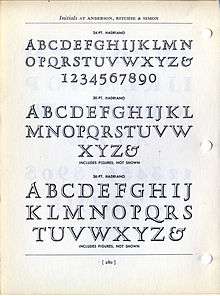
- Hadriano Title (1918, Lanston Monotype + 1927, Continental), matrices cut by Wiebking.
- Hadriano Lower Case (1930, nc), designed by Goudy for Monotype but never cut. In 1932 Monotype released a full-font that consisted of Hadriano Title matched with Kennerley Bold lower case letters.

Goudy Open and Goudy Modern

- Goudy Open (1918, Village Letter Foundry + 1924, Monotype Ltd. + 1927, Continental), matrices cut by Wiebking. An open face design (similar to Imprint Shadowed) but influenced by Didone or Modern serif fonts, such as Didot and Bodoni. The influence is visible in exactly horizontal serifs on letters with ascenders, very different to other Goudy 'open face' designs.[59] Goudy's aim was to 'redeem' the Didone letterform by letting more white space into it, in order to preserve the outline area and bulk of the letterforms while reducing the area of ink on the page.

- Goudy Modern (1918, Village Letter Foundry + 1924, Monotype Ltd. + 1927, Continental), basically just a "filled in" version of Goudy Open, matrices cut by Wiebking.[16][60][61] Perhaps most famously used in the Arion Press's famous 1980 edition of Moby Dick, typeset by Andrew Hoyem, considered one of the most famous books in American fine printing.[62][63][64]
- Goudy Open Italic + Modern Italic (1919, Village Letter Foundry + 1924, Monotype Ltd.), matrices cut by Wiebking. The normal italic was this time made first, then the open design.
- Collier Old Style (1919, ATF), a private type for Proctor & Collier, a Cincinnati advertising agency, matrices cut by Wiebking.

- Lining Gothic (1921, nc), a caps-only, almost sans-serif design with small wedge serifs on the stroke ends. Drawings for this face were complete, but when Wiebking was late in cutting the matrices, the order was cancelled and Goudy lost interest in the design. Example prints are shown in Goudy's autobiography and Elements of Lettering. Writing in 1946, he noted that had he resumed work, he could have anticipated Kabel and Futura with the design. It is also strikingly similar to Albertus of over a decade later.
- Nabisco (1921, privately cast), cut for the National Biscuit Company based on the hand-lettered logotype he had done for them twenty years ago, matrices cut by Wiebking.
Garamont
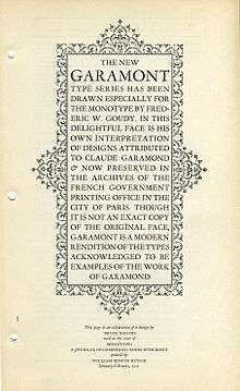
One of Goudy's most popular typefaces in his lifetime, Garamont (1921, Lanston Monotype + 1927, Continental) was loosely based on metal types in the Imprimerie nationale, the French government printing-office, that were at the time thought to be the work of Claude Garamont. Research by Beatrice Warde, published in 1926, revealed that actually these designs were the work of Jean Jannon, working more than fifty years after Garamond's death.[65][66] An elegant sample created by Bruce Rogers was shown in a spring 1923 issue of Monotype's magazine.[67] Garamont features a large range of swash characters. Mosley has described it as "a lively type, underappreciated I think."[68] LTC's digitisation deliberately maintained its eccentricity and irregularity true to period printing, something Goudy had insisted on in his original design, avoiding perfect verticals.[69]
- Goudy Newstyle (1921, Village Letter Foundry + 1927, Continental + 1941 Lanston Monotype), re-cut in 1935 and sold to Monotype who then marketed it as Goudy Bible. It was also used by the Grabhorn Press, who used it in an edition of Leaves of Grass.[70] This face was then adapted by Bruce Rogers and Sol Hess for the famous Oxford Lectern Bible of 1948.
- Italian Old Style + Italic (1924, Lanston Monotype + 1927, Continental)[71][72][73] Often confused with some other faces of the same name, it is notable for its 'A' with serifs on either side of the top. It was used to set Goudy's autobiography.

- Goudy Heavy Face + Italic (1925, Lanston Monotype + 1927, Continental), intended to compete with Cooper Black.[74]
- Marlborough (1925, Village Letter Foundry + 1927, Continental), a private face designed for a printer who lost interest in the project before completion. The matrices were cut by Wiebking and a few fonts were cast by Goudy, and these were destroyed in Goudy's studio fire of 1939. A revised version of this design was sold to Lanston Monotype in 1942, but Monotype apparently did not release it. A picture is shown in Goudy's 1946 memoir.
- Venezia Italic (1925, Monotype Ltd.), made at the request of type designer George W. Jones to accompany his Venezia Roman.
1926 to 1929
From 1926 until his death, Goudy cut all of his own faces (at least in the pilot sizes).[75] From 1927-1929, Goudy cast type at his own Village Letter Foundry and marketed them through the Continental Type Founders Association. After 1929 he ceased casting his own fonts and they were cast for Continental by the New England Type Foundry.[76]
- Goudy Antique (1926, privately cast by Village Letter Foundry + 1927, Continental), the first type matrices actually cut by Goudy himself.
- Aries (1926), privately cast for Spencer Kellogg's Aries Press. A medieval-inspired design with upper- and lower-case.[77]
- Goudy Uncials (1927, nc), drawings were completed, all traces lost in Goudy's 1939 studio fire.
- Companion Old Style + Italic (1927, Lanston Monotype), a private face cut for the Woman's Home Companion magazine. Created with a very full character set, including italic swash caps and small capitals. A set of matrices survives in the collection of the Tampa Book Arts Studio.[78] A favourite of Goudy's, who felt it showed more 'consistent original features than any other face I have ever made, but never digitised.

Deepdene series
A crisp design inspired by a typeface designed in the Netherlands, which Goudy's Paul Bennett wrote was Jan van Krimpen's Lutetia.[79] One of Goudy's more popular designs, with several digital revivals, although as of 2016 only LTC's includes the swash capitals and small caps of Goudy's original design conception.[80][81] Named after Goudy's home in Marlborough.
- Deepdene (1927, Continental, later Lanston Monotype) Changes were made to fit Monotype's machine composition system.
- Deepdene Italic (1928, Continental, later Lanston Monotype), matrices cut by Bertha M. Goudy. Notable for a nearly-upright italic.
- Deepdene Medium (1931, nc), designed for Lanston Monotype but evidently never cast.
- Deepdene Bold + Bold Italic (1934, Lanston Monotype)
- Remington Typewriter (1927, Lanston Monotype) Though intended to be used on Remington typewriters, it was eventually picked up by Monotype. An attempt to avoid the feeling of unevenness of monospaced typefaces (which tend to make letters like 'i' seem too wide and 'W' too squashed) through creating an italic design.[82] Goudy wrote that although he was paid well for the design, he did not know if it had ever been used by Remington.
- Record Title (1927), inspired by Roman capitals, privately cast for Architectural Record magazine at the commission of Charles DeVinne, grandson of the famous printer and type designer, Theodore Low De Vinne.[83]
- Goudy Dutch (1927, nc), designs complete but never cut, all traces lost in Goudy's 1939 studio fire. Based on the handwriting of a letter from a correspondent in the Netherlands, rather than on Dutch printing styles.
- Goudytype (1928, ATF), designed and cut in 1916, not cast and sold until later.
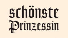
- Goudy Text (1928, Continental, later Lanston Monotype) Originally named 'Goudy Black'.[84][85] A blackletter design, 'text' is short for 'textura', another term used to describe blackletter.
- Inscription Greek (1929, nc), a font of the eleven Greek capitals not found in the Roman alphabet. These were intended to be used with Kennerley Old Style small caps to form a Greek font.

- Lombardic Capitals (1929, Continental + Lanston Monotype), capitals only, intended to serve as alternate, decorative capitals for Goudy Text.[86][87]
- Goudy Sans Serif series An eccentric display-oriented sans-serif design with a highly calligraphic italic. Considered little-used by Goudy in his memoir, although digitised and revived several times since.[19][20][21][22]
- Goudy Sans Serif Heavy or Sans Serif Bold (1929, Lanston Monotype)
- Goudy Sans Serif Light (1930, Lanston Monotype)
- Goudy Sans Serif Light Italic (1931, Lanston Monotype)
- Kaatskill (1929, Continental), a private face cut for the Limited Editions Club edition of Rip Van Winkle.[88]
- Strathmore Title (1929), designed as part of a project for Strathmore Paper Company, only fourteen letters were cut before the project was abandoned.
1930 to 1934
- Unnamed (two faces) (1930), two designs with job numbers from 1930 were destroyed in the fire of 1939. Nothing else known.

- Trajan Title (1930, Continental, later Monotype Ltd.), a private face in the U.S., it was marketed in England and Europe by British Monotype.[89]
- Mediaeval (1930, Continental). Inspired by 'a twelfth-century South German manuscript hand'.[90][91]
- Advertisers Modern (1930, privately cast), cut for the Manuel Rosenberg, publisher of The Advertiser. Apparently little-used, but Goudy retained a proof, shown in his autobiography.

- Goudy Stout, only cut in 24 pt. capitals. Often revived since.[4] Published 1939, Continental.
- Truesdell + Italic (1930, Continental), first used for a preface published in the Colophon No. 5 and named for Goudy's mother.[92]
- Truesdell Italic (1931, Continental)
- Goudy Ornate or Ornate Title (1930, Continental), capitals only.[93][94]
- Deepdene Open Text (1931, Continental), cut as headings for a book by Edmund G. Greiss. A blackletter font for titles and headings, intended to complement but not match Deepdene.
- Deepdene Text (1931, Continental), basically just a "filled-in" version of Deepdene Open Text.
- Goethe (1932, Continental), basically a lighter version of Goudy Modern, cut for the Goethe Centenary Exhibition in Leipzig.
- Goethe Italic (1932, Continental), cut for the Limited Editions Club edition of Frankenstein.
- Quinian Old Style (1932, nc), named for the editor of American Mercury who commissioned the type, however the drawings were rejected and subsequently perished in Goudy's studio fire of 1939.
- Mostert (1932, nc), inspired by the calligraphy of Annelise Mostert. Project never progressed beyond first round of proofs. Goudy donated Mostert's text sample to the Library of Congress.
- Aries (re-cut) (1932, Continental), later sold to Edwin Grabhorn, a San Francisco printer, who had it cast by Lanston Monotype and renamed it Franciscan. Subsequently cast by McKenzie & Harris.[77][95]
- Goudy Boldface (1932, nc), level of completion uncertain, records lost in Goudy's 1939 studio fire.
- Goudy Book (1933, nc), designs complete but never cut, all traces lost in Goudy's 1939 studio fire.
- Mercury (1933, nc), designs complete but never cut, all traces lost in Goudy's 1939 studio fire.
- Saks Goudy, Italic & Bold Caps (1934), a private type cast for Saks Fifth Avenue department store.[96][97]
- Saks Goudy Bold Caps actually consists of the small capitals of larger sizes cast on larger bodies.
- Hasbrouck (1934, nc), designs complete but never cut, all traces lost in Goudy's 1939 studio fire
- Textbook Old Style (1934, nc), designs complete but never cut, all traces lost in Goudy's 1939 studio fire..
1935 to 1938
- Tory Text (1935, Continental), blackletter based on the letters of Geoffroy Tory. Used only for one book, though one of Goudy's favorites. Capitals later cannibalized for New Village Text.
- Atlantis (1935, nc), designs complete but never cut, all traces lost in Goudy's 1939 studio fire.
- Millvale (1935, nc), designs complete but never cut, all traces lost in Goudy's 1939 studio fire.
- Bertham (1936, Continental), named in memory of Goudy's wife, Bertha M. Goudy, who had died the year before.[54][98] Goudy's 100th typeface, done by request for American Printer Magazine. Based on Leonard Holle's 1482 design.
- Pax (1936, nc), matrices were cut, but Goudy was disappointed with the results and never cast the type.
- Ampersands (1936, nc), a collection of 65 ampersands engraved for the Typophiles club in New York for an article on the topic. A reproduction is in Goudy's 1946 memoirs. Most digitised.[77]
- Friar (1937, Continental), designed for his own amusement, Goudy only cast a few fonts of this face in 12 point. Inspired by uncial script but with an upper and lower case.[99]
University of California Old Style

Goudy's 'California' font (1938, Continental) was cut for the University of California Press. It is a 'Venetian' typeface, loosely inspired by the work of Nicolas Jenson. One of Goudy's most popular designs, several releases exist.
After the original type was commissioned for private use, 'California' was released publicly by different companies, first in 1958, by Lanston Monotype as 'Californian' and then famously under the name of 'Berkeley Old Style' by ITC.
In digital versions, 'California' was released by ITC under its pre-existing brand, as 'Californian' by LTC and Font Bureau (in different digitisations) and by Richard Beatty under the name of 'University Old Style'.[100][101][102][103]
Late designs, 1938 to 1945
- New Village Text (1938, Continental), not a new face but a mongrel cast by Goudy's son consisting of capitals from Tory Text and lower-case letters from Deepdene Text.
- Murchison (1938, Photostat Corporation): an experimental design in the new technology of cold type or phototypesetting, which did not become popular until after the end of Goudy's life. Named for the president of Photostat Corporation.
- Bulmer (1939, nc), an attempt to design a lower-case for fine capitals by William Bulmer, never completed.
- Scripps College Old Style (1941), a private face cast for Scripps College. Commissioned by college librarian Dorothy Drake, it was intended for the use of students interested in book making. Later released by Monotype.[104][105]
- Scrips College Italic (1944)
- Spencer Old Style + Italic (1943, nc), commissioned for a large book printing firm but never accepted due to wartime restrictions. Later the design was given to Syracuse University and named for H. Lyle Spencer, dean of the School of Journalism.
- Marlborough Text (1944, Continental), a private face for International Printing Company. Though a complete design, only the letters to print "Certificate of Honor" were ever cut.
- Hebrew University (1945, nc), a font of Hebrew letters commissioned by the American Friends of the Hebrew University in Jerusalem. No casting information available.
- Goudy Thirty (1953, Lanston Monotype), cut with the intention of being issued after Goudy's death, "thirty" being a newspaper term for the end of the story. Goudy finished work on it in 1942 and Monotype waited several years after his death in 1947 before issuing the font.[106][107] The font is inspired by 'rotunda', a style of blackletter handwriting popular in southern Europe in the medieval period. Lawson reports that it was not a great financial success for Monotype, as blackletter type was unfashionable at the time, but that Bruce Rogers was a great admirer of the design.[108]
"Goudy" faces designed by others

- Hearst (1902, Inland Type Foundry). Goudy claimed that this had been copied from lettering he had done for a book of verses for children. It is similar to his Pabst Roman.
- Powell Italic (1908, Keystone Foundry), designed in-house by Keystone. Has the distinction of being the first "non-kerning" italic where no character overhangs the body, an idea that proved quite popular. This is accomplished through the use of reverse curves in the taller letters, which first ascend to the right and then curve back to the left to avoid overhanging the next character.[33]
- Goudy Bold (1916, ATF) and Goudy Bold Italic (1919, ATF), were designed by Morris Fuller Benton as companions to Goudy Old Style. The Lanston Monotype version of the italic includes cursive capitals by Sol Hess.[54] There are some detail differences compared to Goudy Old Style Roman: the 'W' has three terminals not four and there is no serif at bottom right of the 'C'.
- Goudy Title (1918, ATF) is a full size variation on Goudy's small capitals from his Goudy Old Style and was designed by Morris Fuller Benton.
- Goudy Catalog (1919, ATF) and Goudy Catalog Italic (1921, ATF), were designed by Morris Fuller Benton as medium weight companions to Goudy Old Style.[109]
- Goudy Handtooled + Italic (1922, ATF), were in-line versions of Goudy Bold + Italic and were probably designed by Charles H. Becker, though other authorities credit either Morris Fuller Benton or Wadsworth A. Parker. Again, the Lanston Monotype version of the italic includes cursive capitals by Sol Hess.[54][110] The 1937 textbook 26 Lead Soldiers called it "Goudy Bold in a tuxedo." Morison was notably unimpressed by it.
- Italian Old Style Wide (1924, Lanston Monotype), designed by Sol Hess as a companion to Goudy's Italian Old Style.
- Number Eleven series (1924, Ludlow), are out-and-out copies of the Goudy Old Style series.
- Kennerley Open Capitals (1925, Lanston Monotype), were designed by Sol Hess.
- Goudy Heavy Face Open (1926, Lanston Monotype) and Goudy Heavy Face Condensed (1927, Lanston Monotype), were designed by Sol Hess.
- Goudy Extra Bold + Italic (1927, ATF), were a further extension of the Goudy Old Style series by Morris Fuller Benton.
- Foster Italic and Moore Italic (1927, BB&S), were designed by Richard N. McArthur, and based on the English alteration of Goudy Lanston mentioned above.
- Hadriano Stone Cut (1932, Lanston Monotype), was an in-line version of Hadriano Title designed by Sol Hess.
- Goudy Text Shaded (Lanston Monotype), was designed in house by Monotype.
- Pabst Old Style Condensed (Mergenthaler Linotype), was designed in house by Linotype. Pabst Extra Bold, though also cast by Linotype, has no relation to Goudy's face and is actually a knock-off of Cooper Black.
- Goudy Fancy (1970s), italic-only, origin uncertain but resembles a more condensed version of Goudy Heavy italic so may be based on that or one of Goudy's lettering projects. Has been digitised by Canada Type as 'Goudy Two Shoes'.[111]
- Berkeley Old Style (1983, ITC), adaptation of Goudy's University of California Old Style (1938). See above.
- Daylilies, floral capitals based on Goudy Old Style by Judith Sutcliff.[112]
- Goudy Swash, a URW++ release of Goudy Old Style Italic (only) with swash caps.[113]
Goudy also cut the matrices for Foster Abstract, an ultra-bold Art Deco block letter designed by his friend Robert Foster. 1931, Continental with matrices cut by Goudy and cast privately.[114] Goudy personally felt that the design 'violated every canon of type design'.
Considering digital revivals of Goudy's non-character typefaces, P22 has also published an anthology of Goudy's ornament designs, released along with their collection of Goudy's ampersands; Parachute Fonts has also released adaptations of Goudy's initials for Greek and Cyrillic.[77][115][116]
References
In this list, the named publisher describes the company that has digitised the font. The listed website (where given) is a different website/company that offers it on sale at the time of writing if the digitiser does not offer online sale. For example, 'Goudy Light' has been digitised by Red Rooster Fonts, a company who at time of writing sell it through the website MyFonts.
- 1 2 Shaw, Paul. "An appreciation of Frederic W. Goudy as a type designer". Retrieved 12 July 2015.
- ↑ Sloane, Eric (2006). Return to Taos : Eric Sloane's sketchbook of roadside Americana. Mineola, NY: Dover Publications. p. 8. ISBN 9780486447735.
- ↑ Cameron, Alex. "Type Tuesday: Scholarly and beautiful, a 1918 book by typographer Frederic W. Goudy". Eye Magazine. Retrieved 5 February 2016.
- 1 2 Rimmer, Jim. "Poster Paint". Fontspring. Canada Type.
- ↑ Lawson, A. (1990). Anatomy of a typeface. Boston: Godine, p.200.
- ↑ Ovink, G.W. (1971). "Nineteenth-century reactions against the didone type model - I". Quaerendo. 1 (2): 18–31. Retrieved 20 February 2016.
- ↑ Ovink, G.W. (1971). "Nineteenth-century reactions against the didone type model - II". Quaerendo. 1 (4): 282–301. Retrieved 20 February 2016.
- ↑ Mosley, James (2003). "Reviving the Classics: Matthew Carter and the Interpretation of Historical Models". In Mosley, James; Re, Margaret; Drucker, Johanna; Carter, Matthew. Typographically Speaking: The Art of Matthew Carter. Princeton Architectural Press. pp. 31–34. ISBN 9781568984278. Retrieved 30 January 2016.
- ↑ Goudy, Frederic (1946). A Half-Century of Type Design and Typography: 1895-1945, Volume 1. New York: The Typophiles. Retrieved 26 February 2016.
- ↑ Goudy, Frederic (1946). A Half-Century of Type Design and Typography: 1895-1945, Volume 1. New York: The Typophiles. Retrieved 26 February 2016.
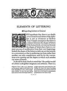
- ↑ Goudy, Frederic (1922). Elements of Lettering. New York: Mitchell Kennerley. Retrieved 26 February 2016.
- ↑ Carter, Matthew. "Goudy, the good ol' boy (Bruckner biography review)". Eye Magazine. Retrieved 5 February 2016.
- ↑ Updike, John. "A Bull in the Typography Shop: a review of Frederic Goudy by D. J. R. Bruckner". New York Times. Retrieved 5 February 2016.
- ↑ "Monotype matrices and moulds in the making" (PDF). Monotype Recorder. 40 (3). 1956.
- ↑ Morison, Stanley. "Printing the Times". Eye. Retrieved 28 July 2015.
- 1 2 "LTC Goudy Modern". MyFonts. LTC. Retrieved 27 August 2015.
- 1 2 "LTC Goudy Old Style Cursive". MyFonts. LTC. Retrieved 27 August 2015.
- ↑ Majoor, Martin. "My Type Design Philosophy".
- 1 2 "LTC Goudy Sans". MyFonts. LTC. Retrieved 27 August 2015.
- 1 2 "Goudy Sans FS". Fontsite. Retrieved 27 August 2015.
- 1 2 "ITC Goudy Sans". MyFonts. ITC. Retrieved 27 August 2015.
- 1 2 "Adobe ITC Goudy Sans". MyFonts. Adobe. Retrieved 27 August 2015.
- ↑ "TYPE BY GOUDY - Modern Mechanix". Modern Mechanix.
- ↑ Carter, Sebastian (2002). Twentieth century type designers (New ed.). Aldershot: Lund Humphries. p. 45. ISBN 9780853318514.
- ↑ Updike, Daniel Berkeley (1922). Printing types : their history, forms, and use; a study in survivals vol 2 (1st ed.). Cambridge, MA: Harvard University Press. p. 243. Retrieved 17 August 2015.
- ↑ Frazier, J.L. (1925). Type Lore. Chicago. p. 103. Retrieved 24 August 2015.
- ↑ Leslie Cabarga (15 February 2004). Logo, Font & Lettering Bible. Adams Media. pp. 108–9. ISBN 1-58180-436-9.
- ↑ Megan Benton (January 2000). Beauty and the Book: Fine Editions and Cultural Distinction in America. Yale University Press. pp. 99–. ISBN 978-0-300-08213-5.
- ↑ Simon Loxley (12 June 2006). Type: The Secret History of Letters. I.B.Tauris. pp. 134–. ISBN 978-1-84511-028-4.
- ↑ Loxley, Simon (31 March 2006). Type: The Secret History of Letters. I.B.Tauris. pp. 93–102. ISBN 978-0-85773-017-6.
- ↑ "LTC Camelot". MyFonts. LTC. Retrieved 26 August 2015.
- ↑ "LTC Pabst Oldstyle". MyFonts. LTC. Retrieved 26 August 2015.
- 1 2 "LTC Powell". MyFonts. LTC. Retrieved 27 August 2015.
- ↑ Lawson, Alexander, Anatomy of a Typeface. Boston: David R. Godine, Publisher, 1990. ISBN 0-87923-332-X. p. 112.
- ↑ "LTC Village No 2". MyFonts. Retrieved 26 August 2015.
- ↑ "Village - Font Bureau". MyFonts. Retrieved 26 August 2015.
- ↑ Frazier, J.L. (1925). Type Lore. Chicago. p. 20. Retrieved 24 August 2015.
- ↑ "Globe Gothic". MyFonts. LTC. Retrieved 27 August 2015.
- ↑ Usherwood & Jackaman. "Goudy 38". MyFonts. Red Rooster Fonts. Retrieved 27 August 2015.
- ↑ Gross, John. "The Fortunes of Mitchell Kennerley, Bookman (book review)". New York Times. Retrieved 5 February 2016.
- ↑ Frederic William Goudy (1940). Typologia: Studies in Type Design & Type Making, with Comments on the Invention of Typography, the First Types, Legibility, and Fine Printing. University of California Press. pp. 48–9. ISBN 978-0-520-03308-5.
- ↑ Lewis Blackwell (2004). 20th-century Type. Laurence King Publishing. p. 191. ISBN 978-1-85669-351-6.
- ↑ "LTC Kennerley". MyFonts. LTC. Retrieved 27 August 2015.
- ↑ Schwartz, Barry. "Goudy Bookletter 1911 (open-source revival, no italic)". League of Movable Type. Retrieved 27 August 2015.
- ↑ Nolan, John; Steffmann, Dieter. "Goudy Twenty". 1001 Fonts. Typographer Mediengestaltung. Retrieved 27 August 2015.
- ↑ "LTC Forum Title". MyFonts. LTC. Retrieved 25 February 2016.
- ↑ Rickner, Tom. "Goudy Forum Pro". MyFonts. Ascender. Retrieved 25 February 2016.
- ↑ Bixler, M&W. "Poliphilus". Michael & Winifred Bixler.
- ↑ "Poliphilus specimen". Flickr. Retrieved 9 December 2015.
- ↑ "The Type Faces used in this Journal" (PDF). Monotype Recorder. 28 (232): 4, 25. 1929. Retrieved 11 January 2016.
- 1 2 3 Shaw, Paul. "Flawed Typefaces". Print magazine. Retrieved 30 June 2015.
- ↑ Alexander S. Lawson (January 1990). Anatomy of a Typeface. David R. Godine Publisher. pp. 110–119. ISBN 978-0-87923-333-4.
- ↑ Schwartz, Barry. "Sorts Mill Goudy". League of Movable Type. Retrieved 2 July 2015.
- 1 2 3 4 Pesala, Bhikku. "Fonts". Softer Views. Retrieved 4 September 2015.
- ↑ "LTC Goudy Oldstyle". MyFonts. Monotype. Retrieved 2 July 2015.
- ↑ Curtis, Nick. "National Old Style NF". MyFonts. Nick's Fonts. Retrieved 25 February 2016.
- ↑ Steffmann, Dieter. "Goudy Initialen". 1001 Fonts. Typographer Mediengestaltung. Retrieved 27 August 2015.
- ↑ "LTC Goudy Initials (more complex Cloister Initials digitisation with negative/positive elements)". MyFonts. LTC. Retrieved 27 August 2015.
- ↑ "LTC Goudy Open". Myfonts. LTC. Retrieved 26 August 2015.
- ↑ "Goudy Modern (with review of digitisations)". Fonts In Use. Retrieved 27 August 2015.
- ↑ "Goudy Modern MT". MyFonts. Adobe/Monotype. Retrieved 25 February 2016.
- ↑ Sherman, Nick. "Moby Dick, the Arion Press edition". Fonts In Use. Retrieved 28 February 2016.
- ↑ Grossman, C: "Andrew Hoyem of Arion Press: Champion of Literary Artistry", Biblio, September 1997.
- ↑ http://www.sfgate.com/cgi-bin/article.cgi?f=/c/a/2006/06/18/MNGAOJENV01.DTL&hw=arion+press&sn=003&sc=660
- ↑ Warde, Beatrice (1926). "The 'Garamond' Types". The Fleuron: 131–179.
- ↑ Allen Kent; Harold Lancour; Jay E. Daily (1 July 1973). Encyclopedia of Library and Information Science: Volume 9 - Fore-Edge Painting to Germany: Libraries and Information Centers in: Training of Documentalists and Information Officers at the Nonuniversity Level in the Federal Republic of Germany. CRC Press. pp. 196–199. ISBN 978-0-8247-2109-1.
- ↑ Rogers, Bruce (January 1923). "Printer's Note". Monotype: A Journal of Composing Room Efficiency: 23.
This issue of Monotype is set in a trial font of a new version of Garamond's design ... the type ornaments, modelled on 16th century ones, will also be available.
- ↑ Mosley, James. "Comments on Typophile thread". Typophile. Archived from the original on February 2, 2015. Retrieved 11 December 2015.
- ↑ "LTC Garamont". MyFonts. LTC. Retrieved 3 December 2015.
- ↑ Megan Benton (January 2000). Beauty and the Book: Fine Editions and Cultural Distinction in America. Yale University Press. pp. 131–133. ISBN 978-0-300-08213-5.
- ↑ Hunt & Grieshaber. "LTC Italian Old Style". MyFonts. LTC. Retrieved 27 August 2015.
- ↑ Beatty, Richard. "Italian Old Style (Beatty)". Fontshop. Retrieved 4 November 2015.
- ↑ "Italian Old Style". MyFonts. Monotype. Retrieved 27 August 2015.
- ↑ "Goudy Heavy Face". Fonts In Use. Retrieved 27 August 2015.
- ↑ Rollins, Carl Purlington American Type Designers and Their Work. in Print, V. 4, #1.
- ↑ Specimen Book of Continental Types, Continental Type Founders Association, N.Y.C., 1929, p. 123.
- 1 2 3 4 Kegler & Kahn. "Goudy Aries". P22. P22. Retrieved 27 August 2015.
- ↑ "A "Lost" Goudy Type Becomes Our New Companion". Tampa Book Arts Studio. Retrieved 27 August 2015.
- ↑ Walter Tracy (January 2003). Letters of Credit: A View of Type Design. D.R. Godine. p. 121. ISBN 978-1-56792-240-0.
- ↑ "LTC Deepdene". MyFonts. LTC. Retrieved 27 August 2015.
- ↑ Schwartz, Barry. "Linden Hill". League of Movable Type. Retrieved 27 August 2015.
- ↑ "LTC Remington". MyFonts. LTC. Retrieved 26 August 2015.
- ↑ "LTC Record Title". MyFonts. LTC. Retrieved 26 August 2015.
- ↑ "LTC Goudy Text". MyFonts. LTC. Retrieved 27 August 2015.
- ↑ "Goudy Text CT". Fontspring. Castle Type. Retrieved 27 August 2015.
- ↑ "Goudy Lombardy (digitisation with alternates)". Fontspring. CastleType. Retrieved 11 September 2015.
- ↑ "Goudy Lombardic Caps". Fontspring. Fontsite. Retrieved 11 September 2015.
- ↑ "LTC Kaatskill". MyFonts. LTC. Retrieved 27 August 2015.
- ↑ "Goudy Trajan Pro (medium weight free, otherwise commercial release)". CastleType. Retrieved 27 August 2015.
- ↑ Beatty, Richard. "Goudy Mediaeval". FontShop. Richard Beatty. Retrieved 27 August 2015.
- ↑ Steffmann, Dieter. "Goudy Mediaeval TM". 1001fonts. Typographer Mediengestaltung. Retrieved 27 August 2015.
- ↑ Matteson, Steve. "Truesdell". Fontshop. Monotype. Retrieved 27 August 2015.
- ↑ "LTC Goudy Ornate". MyFonts. LTC. Retrieved 26 August 2015.
- ↑ "Goudy Ornate MT". MyFonts. Monotype. Retrieved 25 February 2016.
- ↑ Curtis, Nick. "Franciscan Caps NF". MyFonts. Nick's Fonts. Retrieved 25 February 2016.
- ↑ Beatty, Richard. "Goudy Saks (Richard Beatty)". FontShop. Retrieved 27 August 2015.
- ↑ Beatty, Richard. "Saks Goudy". Will Harris. Retrieved 27 August 2015.
- ↑ Matteson, Steve. "Bertham (with added italic)". MyFonts. Ascender. Retrieved 27 August 2015.
- ↑ "Friar". MyFonts. Ascender. Retrieved 27 August 2015.
- ↑ "Californian FB". Font Bureau. Retrieved 19 June 2015.
- ↑ "LTC Californian". MyFonts. LTC. Retrieved 27 August 2015.
- ↑ "University Old Style (an alternative Berkeley Old Style digitisation by Fontsite)". Fontsite. Retrieved 27 August 2015.
- ↑ Beatty, Richard. "University Old Style". Fontshop. Retrieved 4 November 2015.
- ↑ Beatty, Richard. "Claremont (Scripps digitisation)". Will Harris. Retrieved 27 August 2015.
- ↑ "Scripps College Old Style". MyFonts. Monotype. Retrieved 27 August 2015.
- ↑ "LTC Goudy Thirty". P22. LTC. Retrieved 27 August 2015.
- ↑ "Goudy Thirty TM". 1001 Fonts. Typographer Mediengestaltung. Retrieved 27 August 2015.
- ↑ Alexander S. Lawson (January 1990). Anatomy of a Typeface. David R. Godine Publisher. pp. 13–34. ISBN 978-0-87923-333-4.
- ↑ "Goudy Catalog MT". MyFonts. Monotype. Retrieved 31 August 2015.
- ↑ "LTC Goudy Handtooled". MyFonts. LTC. Retrieved 27 August 2015.
- ↑ "Goudy Two Shoes". MyFonts. Canada Type. Retrieved 27 August 2015.
- ↑ "Daylilies and Dayleaves". Will Harris. Judith Sutcliff. Retrieved 25 February 2016.
- ↑ "Goudy Swash". MyFonts. URW++. Retrieved 25 February 2016.
- ↑ Bomparte, John. "Abstrak (Abstract Revival)". MyFonts. Bomparte Fonts.
- ↑ "Goudy Aries Ornaments". MyFonts. Retrieved 17 September 2015.
- ↑ "PF Goudy Initials". Behance. Parachute Fonts. Retrieved 17 September 2015.
- ↑ Dwiggins was referring to Goudy Old Style in particular: "Goudy Old Style may be said to be one hundred per cent good in the design of individual letters. When composed in a body, the characters, individually graceful, set up a whirling sensation that detracts somewhat from legibility. That is to say, the curves are perhaps too soft and round, and they lack a certain snap and acidity. The color of the face is excellent. The capitals, when used alone, compose into a strong and dignified line."
- ↑ Typifying his views, he wrote that 'It is worthy of note that Copperplate Gothic has the tiniest of serifs...sufficient to help its appearance materially. They seem to reduce somewhat the crudity of the letter."
- ↑ This style of 'Y', sometimes called a 'palm Y', is rare in Roman-alphabet fonts, but it was used by early printer Aldus Manutius, for example in his famous illustrated volume Hypnerotomachia Poliphili, and in the Monotype font Poliphilus based on it.[48][49][50] A more muted form of it is used in Hermann Zapf's Palatino.[51]
External links
Writings by Goudy
- "A half-century of type design and typography:" volumes 1 and 2, The Typophiles, New York, 1946. A complete list of Goudy's type designs with commentary.
- "The Alphabet: Fifteen Interpretive Designs" Mitchell Kennerley, N.Y.C, 1918. (alternative digitisation)
- Elements of Lettering (with Bertha Goudy), Mitchell Kennerley, N.Y.C, 1922
- Hello To Those Who Retain Their Sanity, essay, Monotype magazine, 1928
- Ars Typographisch, (Vol. 1, No. 4, 1934): an occasional journal guest-edited by Goudy for one issue in 1934. Contains Goudy's article Type Design: A Homily
- "The Trajan Capitals," Oxford University Press, New York, 1936
- "Typologia" University of California Press, Berkeley, Los Angeles, London, 1940
Additional sources
- Orton, Vrest "Goudy, Master of Letters", Black Cat Press, Chicago, 1939. A festschrift with an introduction by Goudy.
- Lewis, Bernard: Behind the Type: The Life Story of Frederic W. Goudy, Carnegie Institute of Technology, 1941. An extensive survey of Goudy's work. Goudy's 1938 talk on printing, The Ethics and Aesthetics of Type, is printed at the end.
- Rollins, Carl Purlington "American Type Designers and Their Work" in Print, V. 4, #1.
- MacGrew, Mac, "American Metal Typefaces of the Twentieth Century," Oak Knoll Books, New Castle Delaware, 1993, ISBN 0-938768-34-4.
- Bruckner, D.J.R., "Frederic Goudy," Documents of American Design series, Harry N. Abrams, Inc., Publishers, New York City, 1990, ISBN 0-8109-1035-7.
- Type By Goudy (Popular Mechanics article by Andrew R. Boone, April 1942. Many pictures of Goudy at work.)
- Frederic Goudy - Pantagraph (Bloomington, IL newspaper)
- Typographer's Digest, No. 27 (1967): issue dedicated to Goudy's memory. Collects some of Goudy's more obscure writings and fonts, which are shown in a sample at the end.
- Frederick W. Goudy Collection Archives and Special Collections, Ball State University Libraries (PDF)
- The Frederick W. Goudy Collection From the Rare Book and Special Collections Division at the Library of Congress
- Goudy type designs at Lanston Type Co.
- Goudy’s Matrices (Circuitous Root)
- The Deepdene Pantograph (Circuitous Root)