Frederic Goudy

Frederic W. Goudy (Bloomington, Illinois, March 8, 1865 – Marlborough-on-Hudson, May 11, 1947) was an American printer, artist and type designer whose typefaces include Copperplate Gothic, Goudy Old Style and Kennerley.[1]
Biography

Goudy was not always a type designer. "At 40, this short, plump, pinkish, and puckish gentleman kept books for a Chicago Realtor, and considered himself a failure. During the next 36 years, starting almost from scratch at an age when most men are permanently set in their chosen vocations, he cut 113 fonts of type, thereby creating more usable faces than did the seven greatest inventors of type and books, from Gutenberg to Garamond."[2]
Asked how to say his name, he told The Literary Digest "When I was a boy my father spelled our name 'Gowdy' which didn't offer any particular reason for verbal gymnastics. Later learning that the old Scots spelling was 'Goudy,' he changed to that form, while I, for some years, retained the old way. My brother in Chicago still spells with the w. However, I find that occasionally a stranger pronounces the word with ou as long o in go, sometimes as ou in soup, or goo and less frequently with the ou as oo in good. I retain the original pronunciation with ou as in out."[3]
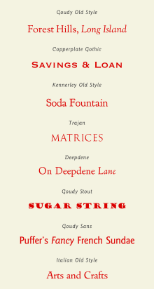
After teaching lettering and becoming known as an advertising designer in Chicago, Goudy built his reputation as type designer. In 1895 he founded his printing shop, Booklet Press (later renamed Camelot Press).[4] Goudy designed his first typeface, Camelot, in 1896. In 1903, Goudy and Will Ransom founded the Village Press in Park Ridge, Illinois. The typeface used for the Village Press, dubbed “Village” was originally created in 1903 for the Chicago clothing manufacturer, Kuppenheimer & Company(cite[5]). This venture was modeled on the Arts and Crafts movement ideals of William Morris. It was moved to Boston, and then New York. In 1908, he created his first significant typeface for the Lanston Monotype Machine Company: E-38, sometimes known as Goudy Light. However, in that same year the Village Press burned to the ground, destroying all of his equipment and designs. In 1911, Goudy produced his first "hit", Kennerley Old Style, for an H. G. Wells anthology published by Mitchell Kennerley. This success was followed by Goudy’s release of the titling letter Forum. Both Kennerley and Forum were cut for private use. Although Goudy was one of the first type designers to become established without working for a foundry, the American Type Founders Company(ATF) became interested in Goudy after his release of Kennerley and Forum. ATF commissioned Goudy to create a typeface. Goudy agreed “on the condition that his original drawings would not be subjected to interference by the founder’s drawing room”.[5] This commission would become Goudy Old Style. Goudy Old Style was released in 1915 and became an instant success. (cite) It was well suited for newspaper’s advertising sections because of its efficient use of space. ATF continued to expand the Goudy ‘family’ to Goudy Title in 1917, Goudy Bold in 1920, Goudy Catalogue in 1921, Goudy Handtooled in 1922 and Goudy Extrabold in 1927. Goudy types were clearly very lucrative for ATF, but Goudy did not receive anything because he had sold his original design for $1,500 instead of entering into a royalty agreement.[5] ATF’s refusal to give Goudy compensation for the success of the Goudy family lead to the deterioration of Goudy’s relationship with ATF. The only other typefaces Goudy designed for ATF was Goudytype, and series of initial letters, named Cloister Initials.[5]
From 1920 to 1947, Goudy was art director for Lanston Monotype. Although he continued to design for Monotype throughout this period, Goudy withdrew to his workshop in Marlborough, New York, which he dubbed the Village Letter Foundery. Goudy withdrew partly because he believed that the methods the Monotype firm used to transfer his designs to matrices compromised his work. “All of Goudy’s types were drawn freehand, without the use of compass, straightedge or French curve.”(cite)[5] It was at the Village Letter Foundery (his workshop) that Goudy created the majority of his prolific work. In 1939, the Village Letter Foundery was destroyed by fire and much of his work was lost. Two of his most successful designs created for Monotype, Deepened and Goudy Text, were not destroyed. Beginning in 1927, Goudy was a vice-president of the Continental Type Founders Association, which distributed many of his faces.
Goudy was widely known from 1915-1940 mainly because of the success of his typefaces, but also because he gave many lectures and speeches on “the great love he had for letter forms”. Goudy was known to rarely turn down a speaking engagement. An excerpt from a lecture he gave to the annual convention of the International Club of Printing House Craftsmen in New York in 1939 highlights Goudy’s practicality and love for letterform. “My craft is a simple one. For nearly forty years I have endeavored constantly to create a greater and more general esteem for good printing and typography, to give printers and reader of print more legible and more beautiful types than were hitherto available.”[5] By the end of his life, Goudy had designed 122 typefaces and published 59 literary works. He worked extensively with his wife Bertha (1869–1935), who particularly collaborated with him on printing projects in which she acted as a compositor of type. The couple had a son, Frederic T. Goudy.
It has been claimed that Goudy was the originator of the well-known statement, "Any man who would letterspace blackletter would shag sheep."[6]
Typefaces

Goudy was the third most prolific designer of metal type in the United States (behind Morris Fuller Benton and R. Hunter Middleton), with ninety faces actually cut and cast, and many more designs completed. His most famous were Copperplate Gothic and Goudy Old Style.[7] Besides printing, he also worked on numerous hand-lettering projects (especially early in his career) and created a large set of ampersands for an article on the topic.[8]
Goudy's career was influenced by the Arts and Crafts movement and the growth of fine book printing in the United States. At a time when printing types had become quite mechanical and geometric under the influence of Didone designs such as Bodoni, Goudy spent his career developing old-style serifs often influenced by the printing of the Italian Renaissance and calligraphy, with a characteristic warmth and irregularity. His neighbour, Eric Sloane, recalled that he also took inspiration from hand-painted signs.[9] In contrast to his great contemporary Morris Fuller Benton, he generally avoided sans-serif designs, though he did create the nearly sans-serif Copperplate Gothic, inspired by engraved letters, early in his career and a few others later. As a result, many of his designs may look quite similar to modern readers. He also developed a number of typefaces influenced by blackletter medieval manuscripts, illuminated manuscript capitals and Roman capitals engraved in stone. Some of his most famous designs such as Copperplate Gothic and Goudy Stout are unusual deviations from his normal style.[10] His sans-serif series, Goudy Sans, adopts an eccentric humanist style with a calligraphic italic.[11][12] Quite unlike most sans-serif types of the period, it was unpopular in his lifetime but revived several times since.[13][14][15]
As an independent artist and consultant, Goudy needed to undertake a large range of commissions to survive, and sought patronage from companies who would commission a typeface for their own printing and advertising.[16] This led to him producing a large range of designs on commission, and promoting his career through talks and teaching.[1][17] As a result, many of his designs may look quite similar to modern readers. His career was aided by the new pantograph engraving technology, which made it easier to rapidly cut the matrices used as moulds to form metal type. This was a considerable advance on the traditional method of cutting punches manually at the size of the letter to be printed, which would be stamped into metal to form the matrix. An additional boon to his career was the new hot metal typesetting technology of the period which created increasing availability and demand for new fonts.
While most of his designs are 'old-style' serif faces, they do still explore a wide range of aspects of the genre, with Deepdene offering a strikingly upright italic, Goudy Modern merging traditional old-style letters with the insistent, horizontal serifs of Didone faces of the eighteenth and nineteenth centuries and Goudy Old Style being sold with a swash italic for display use.[18][19] Goudy kept records of his work (though most of these do not survive due to the fire), giving his typefaces numbers for his own use in a similar way to the opus numbers used by composers. Almost uniquely for type designers of the metal type era, he wrote extensively on his work, including a thorough commentary on each of his designs late in life.
The printer Daniel Berkeley Updike, while respecting some of his work, echoed Goudy's student Dwiggins' comment that his work lacked 'a certain snap and acidity'.[20][21][22][lower-alpha 1] He also wrote that Goudy had "never gotten over" a desire to imitate medieval books.[23] The British printer Stanley Morison, also a veteran of fine book printing whose career at Monotype had moved in the direction of blending tradition with practicality, admired much of Goudy's work and ethos but wrote that Goudy had "designed a whole century of very peculiar looking types", and that he was glad that his company's Times New Roman did not look "as if it has been designed by somebody in particular - Mr. Goudy for instance."[24] Goudy felt in his later life that his career had been overshadowed by new trends, with modernism and a trend towards sharper geometric design making his work out of favor.[25]

In 1938 he designed University of California Old Style, for the sole proprietary use of the University of California Press. The Lanston Monotype Company released a version of this typeface as Californian for wider distribution in 1956, while ITC created a well-known adaptation (and expansion) called Berkeley Old Style or ITC Berkeley, in 1983.[26][27][28]
References
- 1 2 Shaw, Paul. "An appreciation of Frederic W. Goudy as a type designer". Retrieved 12 July 2015.
- ↑ Type By Goudy
- ↑ Charles Earle Funk, What's the Name, Please?, Funk & Wagnalls, 1936
- ↑ Suffield, Laura. "Goudy, Frederic William." Grove Art Online. Oxford Art Online. Oxford University Press. Web. 7 Oct. 2016. <http://www.oxfordartonline.com/subscriber/article/grove/art/T033819>.
- 1 2 3 4 5 6 Lawson, Alexander (1990). The Anatomy of a Typeface. David R. Godine, Publisher. pp. 110–119. ISBN 978-0-87923-333-4.
- ↑ According to typographer Erik Spiekermann, co-author of "Stop Stealing Sheep" (Typophile.com 15.Oct.2005)
- ↑ Carter, Sebastian (2002). Twentieth century type designers : Sebastian Carter. (New ed.). Aldershot: Lund Humphries. p. 45. ISBN 9780853318514.
- ↑ Kegler & Kahn. "Goudy Aries". P22. P22. Retrieved 27 August 2015.
- ↑ Sloane, Eric (2006). Return to Taos : Eric Sloane's sketchbook of roadside Americana. Mineola, NY: Dover Publications. p. 8. ISBN 9780486447735.
- ↑ Rimmer, Jim. "Poster Paint". Fontspring. Canada Type.
- ↑ My type design philosophy by Martin Majoor
- ↑ "LTC Goudy Sans". MyFonts. LTC. Retrieved 27 August 2015.
- ↑ "Goudy Sans FS". Fontsite. Retrieved 27 August 2015.
- ↑ "ITC Goudy Sans". ITC. MyFonts. Retrieved 27 August 2015.
- ↑ "Adobe ITC Goudy Sans". MyFonts. Adobe. Retrieved 27 August 2015.
- ↑ Carter, Matthew. "Goudy, the good ol' boy (Bruckner biography review)". Eye Magazine. Retrieved 5 February 2016.
- ↑ Updike, John. "A Bull in the Typography Shop: a review of Frederic Goudy by D. J. R. Bruckner". New York Times. Retrieved 5 February 2016.
- ↑ "LTC Goudy Modern". MyFonts. LTC. Retrieved 27 August 2015.
- ↑ "LTC Goudy Old Style Cursive". MyFonts. LTC. Retrieved 27 August 2015.
- ↑ Updike, Daniel Berkeley (1922). Printing types : their history, forms, and use; a study in survivals vol 2 (1st ed.). Cambridge, MA: Harvard University Press. p. 243. Retrieved 17 August 2015.
- ↑ Frazier, J.L. (1925). Type Lore. Chicago. p. 103. Retrieved 24 August 2015.
- ↑ Leslie Cabarga (15 February 2004). Logo, Font & Lettering Bible. Adams Media. pp. 108–9. ISBN 1-58180-436-9.
- ↑ Megan Benton (January 2000). Beauty and the Book: Fine Editions and Cultural Distinction in America. Yale University Press. pp. 99–. ISBN 978-0-300-08213-5.
- ↑ Simon Loxley (12 June 2006). Type: The Secret History of Letters. I.B.Tauris. pp. 134–. ISBN 978-1-84511-028-4.
- ↑ Loxley, Simon (31 March 2006). Type: The Secret History of Letters. I.B.Tauris. pp. 93–102. ISBN 978-0-85773-017-6.
- ↑ "Californian FB". Font Bureau. Retrieved 19 June 2015.
- ↑ "LTC Californian". MyFonts. LTC. Retrieved 27 August 2015.
- ↑ "University Old Style (BOS digitisation)". Fontsite. Retrieved 27 August 2015.
- Ransom, Will, "The first days of the Village Press: extracts from the diary of Will Ransom," Press of the Woolly Whale, N.Y.C., 1937.
- Bruckner, D.J.R., "Frederic Goudy," Documents of American Design series, Harry N. Abrams, Inc., Publishers, N.Y.C., 1990, ISBN 0-8109-1035-7.
- Lewis, Bernard, "Behind The Type: The Life Story of Frederic W. Goudy", Department of Printing, Carnegie Institute of Technology, Pittsburgh, 1941
- ↑ Dwiggins was referring to Goudy Old Style in particular: "Goudy Old Style may be said to be one hundred per cent good in the design of individual letters. When composed in a body, the characters, individually graceful, set up a whirling sensation that detracts somewhat from legibility. That is to say, the curves are perhaps too soft and round, and they lack a certain snap and acidity. The color of the face is excellent. The capitals, when used alone, compose into a strong and dignified line."
External links and books
Writings by Goudy
- "A half-century of type design and typography:" volumes 1 and 2, The Typophiles, New York, 1946. A complete list of Goudy's type designs with commentary.
- "The Alphabet: Fifteen Interpretive Designs" Mitchell Kennerley, N.Y.C, 1918. (alternative digitisation)
- Elements of Lettering (with Bertha Goudy), Mitchell Kennerley, N.Y.C, 1922
- Hello To Those Who Retain Their Sanity, essay, Monotype magazine, 1928
- Ars Typographisch, (Vol. 1, No. 4, 1934): an occasional journal guest-edited by Goudy for one issue in 1934. Contains Goudy's article Type Design: A Homily
- "The Trajan Capitals," Oxford University Press, New York, 1936
- "Typologia" University of California Press, Berkeley, Los Angeles, London, 1940
Additional sources
- Orton, Vrest "Goudy, Master of Letters", Black Cat Press, Chicago, 1939. A festschrift with an introduction by Goudy.
- Lewis, Bernard: Behind the Type: The Life Story of Frederic W. Goudy, Carnegie Institute of Technology, 1941. An extensive survey of Goudy's work. Goudy's 1938 talk on printing, The Ethics and Aesthetics of Type, is printed at the end.
- Rollins, Carl Purlington "American Type Designers and Their Work" in Print, V. 4, #1.
- MacGrew, Mac, "American Metal Typefaces of the Twentieth Century," Oak Knoll Books, New Castle Delaware, 1993, ISBN 0-938768-34-4.
- Bruckner, D.J.R., "Frederic Goudy," Documents of American Design series, Harry N. Abrams, Inc., Publishers, New York City, 1990, ISBN 0-8109-1035-7.
- Type By Goudy (Popular Mechanics article by Andrew R. Boone, April 1942. Many pictures of Goudy at work.)
- Frederic Goudy - Pantagraph (Bloomington, IL newspaper)
- Typographer's Digest, No. 27 (1967): issue dedicated to Goudy's memory. Collects some of Goudy's more obscure writings and fonts, which are shown in a sample at the end.
- Frederick W. Goudy Collection Archives and Special Collections, Ball State University Libraries (PDF)
- The Frederick W. Goudy Collection From the Rare Book and Special Collections Division at the Library of Congress
- Goudy type designs at Lanston Type Co.
- Linotype Library Designers: Frederic W. Goudy
- Frederic Goudy Collection - McLean County Museum of History archives
- Frederick Goudy at Typophile
Books printed by Goudy
- Oh, what a plague is love!, Katharine Tynan, 1900 (published by A. C. McClurg & Co., designed by Goudy)
- The Cobbler of Nîme, Mary Imlay Taylor, 1900
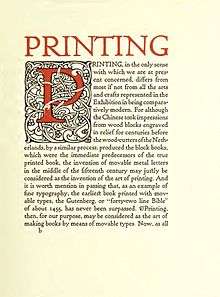
- Printing, William Morris, 1903
- Songs and verses selected from the works of Edmund Waller, 1911
- Verses by Henry Goelet McVickar, 1911
- Why we have chosen Forest Hills Gardens for our home, 1915