Ehrhardt (typeface)
 | |
| Category | Serif |
|---|---|
| Classification |
Old-style Dutch |
| Designer(s) | Nicholas Kis |
| Foundry | Monotype Corporation |
| Date released | 1938, 1680s |
| Design based on | Janson |
| Variations | Fleet Titling |
Ehrhardt is an old-style serif typeface released by British branch of the Monotype Corporation in 1938. Ehrhardt is a modern adaptation of printing types of "stout Dutch character" from the Dutch Baroque tradition sold by the Ehrhardt foundry in Leipzig.[1] These are believed to have been cut by the Hungarian-Transylvanian priest and punchcutter Miklós (Nicholas) Tótfalusi Kis while in Amsterdam in the period from 1680 to 1689.
From 1937 to 1938, Monotype re-cut the type for modern-day usage, and it has become a popular book typeface. Ehrhardt has a slightly condensed design, giving it a strongly vertical, crisp appearance.
Historical background

Miklós Kis, a Transylvanian Protestant priest and schoolteacher, became deeply interested in printing after being sent to Amsterdam to help print a Hungarian Protestant translation of the Bible.[2][3] This was a period of considerable prosperity for the Netherlands and a time when its styles of printing were very influential across Europe, making it a centre for the creation of new typefaces.[4][5][6] He developed a second career as a punchcutter, an engraver of the punches used as a master for making moulds for metal type, working on commission for printers and governments. Kis returned to Transylvania around 1689 and may have left matrices (the moulds used to cast type) in Leipzig on his way home.[7] The Ehrhardt type foundry of Leipzig released a surviving specimen sheet of them around 1720.[8][9]
Kis's typefaces were in the tradition of Dutch and German printing developed over the previous century that would later be called the "Dutch taste" (goût hollandois).[10][lower-alpha 1] This developed the influence of French typefounding such as the typefaces engraved by Claude Garamond with a smooth, even structure and 'e' with a level cross-stroke, by increasing the stroke width, boosting the x-height (height of lower-case letters) and reducing the length of the descenders to achieve a noticeably darker colour on the page.[10]
Kis's surviving matrices were first acquired by Stempel, and are now held in the collection of the Druckmuseum (Museum of Printing), Darmstadt.[12] They were earlier often called the Janson designs, after the Dutch printer Anton Janson, based in Leipzig, who it was once believed might have created them, and Linotype's revival of the same designs in a less condensed form accordingly is named Janson.[13][14] Kis's identity as the maker of the typefaces was rediscovered by comparison with type from Hungarian archive sources (including an autobiography) on which his name was identified.[15][16][17]
Modern history
Monotype's development of Ehrhardt took place under the influence of executive and historian of printing Stanley Morison, not long after their successful creation of Times New Roman, which had also been (more loosely) inspired by Dutch Baroque printing.[18] It began from a recognition that the Janson designs were well-respected by fine printers of the Arts and Crafts period such as Daniel Berkeley Updike, who could print books from them using hand-set type cast from surviving original matrices owned by the Stempel company of Germany. Morison had discussed what he knew of their history with Updike in their extensive correspondence from the 1920s onwards.[19] Modernised versions of the Janson designs were being created by Linotype and Monotype's American branch at the same time.[7] In addition, Morison was interested in the history of printing in Leipzig, a centre of the German book trade, and would later write an article on the topic.[16]
Ehrhardt's development took place following a series of breakthroughs in printing technology which had occurred over the last fifty years without breaking from the use of metal type. Pantograph engraving had allowed punches to be precisely machined from large plan drawings. This gave a cleaner result than historic typefaces whose master punches had been hand-carved out of steel at the exact size of the desired letter. It also allowed rapid development of a large range of sizes with the same consistent style of letter in all of them, although in fact the design was adjusted to produce a clear image at different sizes, for instance by widening the letters and spacing and increasing the x-height.[21][20] In addition, hand printing had been superseded by the hot metal typesetting systems of the period, of which Monotype's was one of the most popular (in competition with that of Linotype's). Both allowed metal type to be quickly cast under the control of a keyboard, eliminating the need to manually cast metal type and slot it into place into a printing press. With no need to keep type in stock, just the matrices used as moulds to cast the type, printers could use a wider range of fonts and there was increasing demand for varied typefaces. Artistically, meanwhile, the preference for using mechanical, geometric Didone letterforms introduced in the eighteenth and nineteenth centuries was being displaced by a revival of interest in "old-style" serif fonts developed before this, a change that has proved to be lasting.[22][23][24] At the same time, hot metal typesetting had imposed new restrictions: in Monotype's system (while less restrictive than Linotype's), in order to mechanically count the number of characters that could be fitted on a line, letters could only be certain widths, and care was needed to produce letters that looked harmonious in spite of this.[24]


Monotype developed a revival of the Ehrhardt typefaces using a rediscovered specimen sheet as a source, while simultaneously also working on Van Dijck, a revival of the work of Christoffel van Dijck (d. 1669), a slightly earlier Dutch Baroque punch-cutter.[25][26] Ehrhardt's original working title was 'Old Holländische', according to veteran Monotype designer Robin Nicholas.[27]
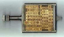
Developed by the Monotype drawing office team in Salfords, Surrey, led by Fritz Steltzer, the project veered away from a purely faithful revival towards a denser, more condensed design.[28][29][30] This differentiated it from the other Janson revivals on the market.[7][31][32] Nicholas commented "I think it was Morison's take on Janson - made a little heavier and narrower to give improved legibility and economy."[27] Typesetting expert Yannis Haralambous wrote of being told by a Monotype manager that the typeface was designed particularly for sale in Germany "to appeal to those who have a weakness for Fraktur" (blackletter or 'Gothic' typefaces, still very popular in Germany in the 1930s).[33] In its dense design it may be able to compliment blackletter well, and Morison in his article on Leipzig printing suggested that this might have been a motivation behind the original's design style.[16] Ehrhardt's technical production followed Monotype's standard method of the period. The characters were drawn on paper in large plan diagrams by the highly experienced drawing office team, led and trained by Steltzer, who Monotype had recruited from the German printing industry. The drawing staff who executed the design was disproportionately female and in many cases recruited from the local area and the nearby Reigate art school. A wax-copy was made from these drawing, the wax-copy was used to produce a lead plate with the design. These plates were then used as a plan for machining metal punches to stamp matrices in the Benton-pantographs.[34][35] It was Monotype's standard practice at the time to first engrave a limited number of characters and print proofs from them to test overall balance of colour on the page, before completing the remaining characters.
The finished design was first displayed in Monotype's journal, the Monotype Recorder, in 1938 with an unsigned blurb in what Carter would later call "the accents of Morison".[7][36] Morison's article on the history of printing in Leipzig would later be typeset in it and it was also used to set a festschrift on his work after his death.[16][37]
Distinctive features
Distinctive features of Ehrhardt include an 'A' with gently curving bar matching the centre-link of the 'B', a wide 'T' with spreadeagled serifs on either side and a 'b' with no foot on the left. In italic the 'J' has a crossbar, the 'w' has sharp reverse curves towards the top and left, and the 'v' has a flourish on the left.[1][38] The face has high stroke contrast (difference between thick and thin strokes) by the standards of most old-style serif fonts. In order to allow compact line spacing, descenders were kept reasonably short.[39]
Reception

Ehrhardt attracted considerable attention on its initial release; Monotype's publicity material blurbed it as "in the opinion of some authorities, the most important new book face since Times New Roman".[40] However Ehrhardt remains considerably less well-known than many of Monotype's other classic serif designs of the interwar period, such as Times, Perpetua, Garamond or Bembo.[28]
Harry Carter (who with George Buday made the modern attribution to Kis) wrote that "the letters of Monotype Ehrhardt are like those of the Janson, but the appearance of a page set in it is different. The Janson is more rotund and has greater contrast of thick and thin."[7] Writing in the 1970s, Carter had misgivings about the condensation, saying that it came close to turning Kis's work into an "accurate drudge" but that "it is a successful type-face".[7] He also noted the irony that, unknown to the Monotype drawing office, Kis had designed himself a set of more condensed typefaces for use in Florence which they might have used as a more authentic model.[7] Printing historian James Mosley's review of Morison's memoir, A Tally of Types, described the original metal type as "crudely drawn" compared with some earlier Monotype designs, and suggested that this was due to a change in works management at Monotype with the retirement of head engineer Frank Hinman Pierpont.[41]
Notable books set in Ehrhardt include the Oxford World's Classics series, the New English Bible, the Pelican Shakespeare and the Penguin 60s.[39][42][43][44] It has also been used by Faber and Faber and The Iconic magazine.[45][44] An extremely rare infant variant of the typeface also exists, which can be seen in the American edition of the book Hey! Get off Our Train by John Burningham.[46]
Extensions
Monotype later created a bold and bold italic (called a semi-bold in some digitisations) to match the roman and italic of the original release.[7][47] (True bold type did not exist in Kis's time.[48]) Released in 1967, Fleet Titling was a capitals-only alphabet intended to serve as a companion for titling use. It was created by Monotype's occasional collaborator John Peters, a Cambridge University Press designer who also worked as a private printer.[49][50][51] Monotype used it for their logo and letterhead.[27][52] More oddly, Monotype in the 1960s used Ehrhardt as a base for printing in the Initial Teaching Alphabet. This alphabet system, intended to be used to teach children to read, used alternative characters for different sounds spelled with the same letter, like t's and c's dropped below the baseline of the text.[53][54]
Digitisations and alternative versions

Monotype has digitised Ehrhardt into the TrueType and OpenType font formats. It is sold in standard and professional releases, some releases including text figures and small caps (in the roman style only). Like several other Monotype typefaces digitised in the early period of computerised publishing, it is sold under two releases credited both to Monotype itself and to Adobe, the latter only in the standard version without small caps.[1][55] Fleet Titling and the Initial Teaching Alphabet version have not been digitised.
Inspired by Ehrhardt, designer and lawyer Matthew Butterick created a revival called Equity, praising its "satisfying heft and authority".[28] This design was inspired by his experiences of office needs from working as a lawyer; it was created for sale with separate grades designed to suit different types of paper and printers, and separate small caps fonts (in regular and bold) intended for use in Word.[56][57] Font Bureau also created the very large revival family Kis. Unlike other digitisations, this has been released in optical sizes, with a separate display-size font intended for headlines. It is used by the Los Angeles Times but (as of 2015) has not been released for online sale.[58][lower-alpha 2]
References
- 1 2 3 "Ehrhardt (Adobe release)". MyFonts. Monotype/Adobe. Retrieved 5 November 2015.
- ↑ Lawson, Alexander (1990). Anatomy of a Typeface (1st ed.). Boston: Godine. pp. 158–168. ISBN 978-0-87923-333-4.
- ↑ Rozsondai, Marianne (2004). "The bindings of books printed by Miklos Misztotfalusi Kis". E codicibus impressisque : opstellen over het boek in de Lage landen voor Elly Cockx-Indestege. Leuven: Peeters. pp. 149–170. ISBN 978-90-429-1423-0.
- ↑ Middendorp, Jan (2004). Dutch type. Rotterdam: 010 Publishers. p. 25. ISBN 978-90-6450-460-0. Retrieved 27 July 2015.
- ↑ "Miklós Kis" (PDF). Klingspor Museum. Retrieved 6 November 2015.
- ↑ "Quarto". Hoefler & Frere-Jones. Retrieved 9 December 2015.
- 1 2 3 4 5 6 7 8 Morison, Stanley; Carter, Harry (1973). "Chapter 8: Ehrhardt". A Tally of Types. Cambridge: Cambridge University Press. pp. 117–122. ISBN 978-0-521-09786-4. Retrieved 11 September 2015.
- ↑ "Ehrhardt Specimen Book image". Rietveld Academie. Retrieved 6 November 2015.
- ↑ Updike, Daniel Berkeley (1922). "Chapter 15: Types of the Netherlands, 1500-1800". Printing Types: Their History, Forms and Uses: Volume 2. Harvard University Press. p. 44. Retrieved 18 December 2015.
A headline...reads "Real Dutch Types"...These fonts resemble those given by Fell to the Oxford Press, and in cut belong to the 17th century. Their provenance I do not know. Although heavy, they retain considerable vivacity of line and have great capabilities when used with taste.
- 1 2 Johnson, A. F. (1939). "The 'Goût Hollandois'". The Library. s4-XX (2): 180–196. doi:10.1093/library/s4-XX.2.180.
- ↑ Mosley, James. "Type and its Uses, 1455-1830" (PDF). Institute of English Studies. Retrieved 7 October 2016.
- ↑ Mosley, James. "The materials of typefounding". Type Foundry. Retrieved 14 August 2015.
- ↑ "Janson Text". MyFonts. Adobe/Linotype. Retrieved 5 November 2015.
- ↑ Heiderhoff, Horst (1984). "The Rediscovery of a Type Designer: Miklos Kis". Fine Print: 25–30.
- ↑ Heiderhoff, Horst (1988). "The Rediscovery of a Type Designer: Miklos Kis". In Bigelow, Charles. Fine Print on Type: the best of Fine Print magazine on type and typography. San Francisco: Fine Print. pp. 74–80. ISBN 978-0-9607290-2-9.
- 1 2 3 4 Morison, Stanley (2009). "Chapter 8: Leipzig as a Centre of Type-Founding". In McKitterick, David. Selected essays on the history of letterforms in manuscript and print (Paperback reissue, digitally printed version ed.). Cambridge: Cambridge University Press. pp. 149–170. ISBN 978-0-521-18316-1.
- ↑ Buday, George (1974). "Some More Notes on Nicholas Kis of the 'Janson' Types". Library: 21–35.
- ↑ Haslam, Andrew; Baines, Phil (2005). Type & typography (2nd ed.). London: Laurence King. p. 65. ISBN 978-1-85669-437-7.
- ↑ McKitterick, David, ed. (1979). Stanley Morison & D.B. Updike: Selected Correspondence. Scolar Press. pp. 24–5, etc.
- 1 2 "Monotype matrices and moulds in the making" (PDF). Monotype Recorder. 40 (3). 1956.
- ↑ Morison, Stanley. "Printing the Times". Eye. Retrieved 28 July 2015.
- ↑ Lawson, A. (1990). Anatomy of a typeface. Boston: Godine, p.200.
- ↑ "Facts about Bembo" (PDF). Monotype Recorder. 32 (1): 15.
- 1 2 Bigelow, Charles; Seybold, Jonathan (1981). "Technology and the aesthetics of type". The Seybold Report. 10 (24): 3–16. ISSN 0364-5517.
- ↑ "Van Dijck MT". MyFonts. Monotype. Retrieved 11 September 2015.
- ↑ Kinross, Robin (2004). Modern Typography: an essay in critical history (PDF) (2nd ed.). London: Hyphen. p. 79. ISBN 978-0-907259-18-3. Retrieved 14 December 2015.
- 1 2 3 Daniels, Simon; Nicholas, Robin. "Comments on Typophile thread". Typophile. Archived from the original on January 23, 2015. Retrieved 8 December 2015.
- 1 2 3 Butterick, Matthew. "Equity specimen" (PDF). Practical Typography. pp. 3–4. Retrieved 13 July 2015.
- ↑ Coltz, Jon. "A long, passionate Kis, Part 1". daidala. Retrieved 14 December 2015.
- ↑ Coltz, Jon. "A long, passionate Kis, Part 2". daidala. Retrieved 14 December 2015.
- ↑ Tracy, Walter (2003). Letters of Credit: A View of Type Design. p. 39. ISBN 9781567922400. Retrieved 16 December 2015.
- ↑ Barker, Nicolas (1972). Stanley Morison. Harvard University Press.
- ↑ Haralambous, Yannis (2007). Fonts & encodings (1st ed.). Sebastopol, Calif.: O'Reilly Media. p. 381. ISBN 978-0-596-10242-5.
This typeface was destined primarily for the German market. According to a manager at Monotype, "this typeface was designed to appeal to those who have a weakness for Fraktur."
- ↑ Rhatigan, Daniel (September 2014). "Gill Sans after Gill" (PDF). Forum (28): 3–7. Retrieved 26 December 2015.
- ↑ Rhatigan, Dan. "Time and Times again". Monotype. Retrieved 28 July 2015.
- ↑ "Typographic Problems of the Illustrated Book" (PDF). Monotype Recorder. 37 (2): 4–7. 1938.
[A] pleasing degree of condensation ... gives increased legibility by its increased x-height and at the same time conserves space. These advantages give wide scope for ... much of the bookwork of today.
- ↑ Barr, John, ed. (1971). "Colophon". Stanley Morison: a portrait. Trustees of the British Museum. p. 2.
- ↑ "Fifty Years of Type-Cutting" (PDF). Monotype Recorder. 39 (2): 27.
- 1 2 Watson; William (1969). The New Cambridge Bibliography of English Literature, Volume 3; Volumes 1800–1900. Cambridge University Press. p. xiv. Retrieved 9 December 2015.
The page [is] set in Monotype Ehrhardt, a compact fount with short descenders ... to accommodate the maximum possible amount of text matter consistent with the degree of legibility necessary
- ↑ "Ehrhardt". Signature: A Quadrimestrial of Typography and Graphic Arts: 71. 1949. Retrieved 9 December 2015.
The crisp, relatively narrow and extraordinarily 'large appearing' style of letter which the Monotype corporation revived and named Ehrhardt is, in the opinion of some authorities, the most important new book face since Times New Roman, and it has already been chosen for a number of noteworthy publications in England and in America
- ↑ Mosley, James (2001). "Review: A Tally of Types". Journal of the Printing Historical Society. 3, new series: 63–67.
That it was Pierpont himself who was central to this drive for quality is made abundantly clear by the abrupt changes that are seen after his retirement in 1937. All the types produced during the brief period before the Second World War, although they naturally have many fine features, are more or less flawed. Monotype Joanna is crudely drawn by comparison with the original type…Ehrhardt is also crudely drawn compared with its predecessors, and its incongruous figures - which are quite wrong for its place and period - were adapted from those of Imprint. Similarly, the figures for Van Dijck are those of Bembo (which in their turn seem to be derived from Plantin) and their failure to match the delicate serif treatment of the type itself is painfully apparent.
- ↑ Luna, Paul (2011). Books & Bits: Texts & Technology, 1970–2000, from A Companion to the History of the Book. Hoboken: John Wiley & Sons. p. 381. ISBN 978-1-4443-5658-8.
- ↑ Luna, Paul. "Making notes user-friendly". Luna's Cafe (blog).
Ehrhardt, the default typeface for OWCs, has a very hairy asterisk that fills in at small sizes
- 1 2 Hendel, Richard (2013). Aspects of contemporary book design. Iowa City: University of Iowa Press. pp. 129, 156. ISBN 978-1-60938-175-2.
- ↑ "Fonts in use: The Iconic". Fonts in use. Retrieved 5 November 2015.
- ↑ Burningham, John (1994). Hey! get off our train (1st Dragonfly Books ed.). New York, N.Y.: Crown Publishers. ISBN 978-0-517-88204-7.
- ↑ Moran, James. "Stanley Morison, 1889–1967" (PDF). Monotype Recorder. 43 (3): 26.
- ↑ Haley, Allan. "Bold type in text". Monotype. Retrieved 11 August 2015.
- ↑ Macmillan, Neil (2006). A-Z of type designers. London: Laurence King. p. 146. ISBN 978-1-85669-395-0.
- ↑ Devroye, Luc. "John Peters". Retrieved 6 November 2015.
- ↑ Pitt, John. "John Peters, some further thoughts, especially on Fleet Titling". Stone Letters. Retrieved 6 November 2015.
- ↑ "Schriftdesigner John Peters" (PDF). Klingspor Museum. Retrieved 6 November 2015.
- ↑ Pitman MP, James (1960). "The Readability of Type (letter)". New Scientist. Retrieved 9 December 2015.
- ↑ Haas, William (1969). Alphabets for English. p. 46. Retrieved 9 December 2015.
- ↑ "Monotype Ehrhardt". MyFonts. Monotype. Retrieved 5 November 2015.
- ↑ Butterick, Matthew. "Equity". Practical Typography. Retrieved 13 July 2015.
- ↑ Porchez, Jean François. "Equity review". Typographica. Retrieved 13 July 2015.
- ↑ "Kis FB". Font Bureau. Retrieved 26 July 2015.
- ↑ "Bitstream Kis". MyFonts. Bitstream. Retrieved 5 November 2015.
- ↑ "Bitstream Kis (Paratype release with Cyrillic)". MyFonts. Paratype/Bitstream. Retrieved 5 November 2015.
- ↑ This term originates from the writings of Pierre Simon Fournier in the next century.[11]
- ↑ Another design named Kis has been offered for sale by Bitstream Inc. and its Russian licensee Paratype; it is reportedly based on Linotype Janson.[59][60]
External links
On Ehrhardt:
Ehrhardt digitisations:
- Ehrhardt typeface family at MyFonts.com
- Butterick's revival, Equity
- Kis FB (as of 2015 no online sale)
On other Kis/Janson revivals:
- Kis Antiqua (an account of an alternative German revival)
On Van Dijck:
Monotype typefaces | |
|---|---|
| 1900s |
|
| 1910s |
|
| 1920s |
|
| 1930s |
|
| 1940s |
|
| 1950s |
|
| 1960s | |
| 1970s |
|
| 1980s | |
| 1990s |
|
| 2000s |
|
| 2010s |
|