Ed Benguiat

Ed Benguiat (pron. [ben-gåt]; born Ephram Edward Benguiat, October 27, 1927) is an American typographer and lettering artist. He has crafted over 600 typeface designs including Tiffany, Bookman, Panache, Souvenir, Edwardian Script, and the self-titled Benguiat and Benguiat Gothic.
He is also known for his designs or redesigns of the logotypes for Esquire, The New York Times, Playboy, McCall’s, Reader’s Digest, Photography, Look, Sports Illustrated, The Star-Ledger, The San Diego Tribune, AT&T, A&E, Coke, Estée Lauder, Ford, and others.[1] Other notable examples of Benguiat’s work are the logotypes for the original Planet of the Apes film, Super Fly, and The Guns of Navarone. Ed Benguiat was one of the most prolific lettering artists and became typographic design director at Photo-Lettering, known as PLINC.
In the early 1970s he began teaching at the School of Visual Arts in his native New York and continues to work there.[2][3]
Personal life
Benguiat grew up in Brooklyn, New York. He was once a very prominent jazz percussionist playing in several big bands with the likes of Stan Kenton and Woody Herman. In an interview Benguiat stated this of his chosen career as a designer: "I’m really a musician, a jazz percussionist. One day I went to the musician’s union to pay dues and I saw all these old people who were playing bar mitzvahs and Greek weddings. It occurred to me that one day that’s going to be me, so I decided to become an illustrator."[4]
Benguiat is an avid pilot and enjoys flying his personal airplane.
Published fonts
Most of Benguiat's published work was released through International Typeface Corporation. This includes:
- ITC Barcelona
- ITC Benguiat
- ITC Benguiat Gothic
- ITC Bookman
- ITC Caslon No. 224
- ITC Century Handtooled
- ITC Edwardian Script
- ITC Modern No. 216
- ITC Panache
- ITC Souvenir
- ITC Tiffany
Collaborations:
- ITC Avant Garde (condensed styles only)
- ITC Bauhaus (with Victor Caruso)
- ITC Cheltenham Handtooled (with Tony Stan)
- ITC Korinna (with Victor Caruso)
- ITC Lubalin Graph (with Herb Lubalin)
For other companies:
- Ed Benguiat Font Collection (House Industries), including:
- Ed Brush
- Ed Gothic
- Ed Interlock
- Ed Roman
- Ed Script
- PL Benguiat Frisky
Most of Benguiat's designs qualify as display types intended for headings and posters; few are designed for body text.
The Ed Benguiat Font Collection
The Ed Benguiat Font Collection is a casual font family named after the designer. Designed by Ed Benguiat and House Industries, the CD includes 5 Benguiat-inspired typefaces and a series of whimsical icons, dubbed "bengbats," an exclusive interview by the House Industries staff, and Benguiat's own jazz percussion in the background. Unlike Benguiat's earlier, pre-computer work, the family uses extensive OpenType programming to replicate the hand-made, custom feeling of custom lettering, similar to classic film posters and record sleeves.[5][6]
References
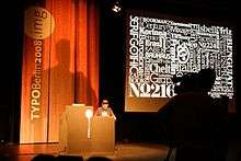
- ↑ Halperin, Elisa. "TYPO Berlin 2008 Image". Retrieved 10 July 2014.
- ↑ Grant, Angelynn. "The Ed Benguiat Collection." Communication Arts 46.7 (2004): 194-197. Communication & Mass Media Complete. Web.
- ↑ Bruckner, D. J. R. "DESIGN VIEW; How the Alphabet Is Shaping Up In a Computer Age", The New York Times, September 10, 1989. Accessed November 27, 2007. "This autumn he will receive the Type Directors Club award, and two retrospectives of his work are scheduled for early next year, one at the School of Visual Arts, where he teaches, and one at the International Typeface Corporation's gallery on Hammarskjold Plaza."
- ↑ Q&A with Ed Benguiat at the Wayback Machine (archived July 19, 2011)
- ↑ Twardoch, Slimbach, Sousa, Slye (2007). Arno Pro (PDF). San Jose: Adobe Systems. Retrieved 14 August 2015.
- ↑ "Ed Benguiat font collection". House Industries. Retrieved 26 January 2016.