Albertus (typeface)
 | |
| Category | Serif |
|---|---|
| Classification | Glyphic |
| Designer(s) | Berthold Wolpe |
| Commissioned by | Stanley Morison |
| Foundry | Monotype Corporation |
| Date created | 1932 |
Albertus is a glyphic serif typeface designed by Berthold Wolpe in the period 1932 to 1940 for the British branch of the printing company Monotype. Wolpe named the font after Albertus Magnus, the thirteenth-century German philosopher and theologian.
Wolpe studied as a metal engraver, and Albertus was modeled to resemble letters carved into bronze. The face began as titling capitals. Eventually a lowercase roman was added, and later a strongly cursive, narrow italic. Albertus has slight glyphic serifs. It is available in light and italic varieties.
The project began in 1932. Titling caps were released first, and the Monotype Recorder of summer 1935 presented the capitals as an advance showing.[1] Other characters and a lower case were added by 1940.
Characteristics
.jpg)
- In the uppercase "M" the middle strokes descend only partway, not reaching the baseline, in the default version.
- The uppercase "U" has a stem on the right side.
- Figures are lining.
In the metal type period, Albertus was offered with alternate characters, including a different 'J' that stops at the baseline, an 'M' that reaches the baseline, and a different ampersand, similar to that used on Dwiggins' Metro.[2][3]
Wolpe later designed Pegasus, a spiky serif design intended to complement Albertus for body text. It was never particularly popular and has not been released digitally, although Matthew Carter has digitised it and added a bold and italic as part of a commemorative exhibition project.[4][5]
Phototypesetting copies

Albertus' popularity has continued right. During the phototypesetting period, it was made available for photocomposition by Monotype and other vendors.
Digitisations
Monotype has released a digital version.[6] Albertus digitisations have also been sold by Adobe, Bitstream, Fontsite, SoftMaker and others.[7][8] (As many early digitisations were sublicensed, several of these may represent the same digitisation marketed by different rights-holders, possibly upgraded with modern features such as contextual ligature substitution.)
URW++ released a lookalike version known as A028 for free for use with Ghostscript and TeX. Featuring medium and extra-bold weights but no italics, A028 is widely available on Linux systems and other open source environments.
Use

- Albertus was, for many years, the typeface used on British coinage.
- Albertus is used for the street name signs in the City of London, City of London Corporation and London Borough of Lambeth (where Wolpe resided until his death in 1989).
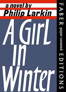
- Albertus was used in many book jackets designed by Wolpe for the London publisher Faber and Faber.
- Albertus is used as the brand font for the Peter Jackson's The Hobbit film series adapted from J. R. R. Tolkien's book.
- A slightly modified version was used extensively in The Prisoner (1967–68), a British television series frequently mined for cultural references. Modifications to the Albertus font include opening the loop on the lowercase e and the addition of new dotless i and j characters. The typeface was also used for a role playing game supplement based on the TV show, published by Steve Jackson Games.
- In the Stanley Kubrick film 2001: A Space Odyssey (1968) the Albertus typeface is used for the ‘Dawn Of Man’ title card
- The David Lynch film Dune (1984) uses an alternate version of Albertus[9]
- Albertus has frequently been used by the band Coldplay. The font was for instance used on the covers of Parachutes, A Rush of Blood to the Head, X&Y, Live 2003, associated singles and also for the "Christmas Lights" single cover.
- Albertus is used for the cover of Howl and Other Poems by Allen Ginsberg.
- Albertus is used for the logo, titles and credits of the British TV crime drama, Scott & Bailey, screened from May 2011 on ITV1.
- Nearly all of John Carpenter's films begin and end with white-on-black credits, set in the Albertus typeface, without any scrolling.
- The Buffy the Vampire Slayer board game
- The 2011 videogame, Uncharted 3: Drake's Deception.
- The lettering on the cover of Rank by The Smiths is set in Albertus Bold.
- Albertus is used for the Ottawa Senators NHL Franchise
- Albertus is used on the opening title sequence of The Guest film.
- Albertus is used in Silent Hill 1 through 4 for in-game text.
- Albertus is used for landmark notices by the RSC.
See also
- Carter Sans (2011), influenced by Albertus
Albertus has no connection to Albertina, a crisp Dutch serif font created for Monotype by calligrapher Chris Brand in 1965.[10][11][12]
References
- ↑ "Front cover" (PDF). Monotype Recorder. 34 (2): 1–2. 1935. Retrieved 16 September 2015.
- ↑ Coles, Stephen; Fidlin, Noah. "Parachutes by Coldplay". Fonts In Use. Retrieved 15 April 2016.
- ↑ Coles, Stephen. "Albertus 481". Flickr. Retrieved 15 April 2016.
- ↑ Shaw, Paul. "Overlooked Typefaces". Print magazine. Retrieved 2 July 2015.
- ↑ Margaret Re; Johanna Drucker; James Mosley; Matthew Carter (1 July 2003). Typographically Speaking: The Art of Matthew Carter. Princeton Architectural Press. pp. 6, 73. ISBN 978-1-56898-427-8.
- ↑ "Albertus MT". MyFonts. Monotype. Retrieved 22 August 2016.
- ↑ "Flareserif 821". MyFonts. Bitstream. Retrieved 22 August 2016.
- ↑ "Adelon Serial". MyFonts. Softmaker. Retrieved 22 August 2016.
- ↑ "Other Dune Fonts".
- ↑ Middendorp, Jan (2004). Dutch type. Rotterdam: 010 Publishers. pp. 144–149. ISBN 9789064504600.
- ↑ Brand, Chris. "Albertina". Retrieved 16 September 2015.
- ↑ "DTL Albertina". Dutch Type Library. Retrieved 17 September 2015.
- Blackwell, Lewis. 20th Century Type. Yale University Press: 2004. ISBN 0-300-10073-6.
- Fiedl, Frederich, Nicholas Ott and Bernard Stein. Typography: An Encyclopedic Survey of Type Design and Techniques Through History. Black Dog & Leventhal: 1998. ISBN 1-57912-023-7.
- Jaspert, W. Pincus, W. Turner Berry and A.F. Johnson. The Encyclopædia of Type Faces. Blandford Press Lts.: 1953, 1983. ISBN 0-7137-1347-X.
- Macmillan, Neil. An A–Z of Type Designers. Yale University Press: 2006. ISBN 0-300-11151-7.
- Williams, Owen Berthold Wolpe and His Typeface Albertus Letter Arts Review, Vol 20 No 1, 2006
External links
- Albertus Pro
- Albertus at Monotype
- Albertus Font Family - by Berthold Wolpe
- A028: an open-source digitisation of regular and bold roman styles
Monotype typefaces | |
|---|---|
| 1900s |
|
| 1910s |
|
| 1920s |
|
| 1930s |
|
| 1940s |
|
| 1950s |
|
| 1960s | |
| 1970s |
|
| 1980s | |
| 1990s |
|
| 2000s |
|
| 2010s |
|